# What is Tambo? URL: / import LearnMore from "@/components/learn-more"; Tambo is a **React package** for building AI-powered applications with generative UI, where users interact through natural language. Use Tambo to build AI chats, copilots, or completely custom AI interactions. ## Core Elements ### React package `@tambo-ai/react` The react package provides hooks that help you build the list of components and tools Tambo can use, send user messages to the Tambo API, and interact with responses and message threads. Wrap your app with the `` and use the hooks within your components to send messages and show responses. ```tsx import { TamboProvider } from "@tambo-ai/react"; export function Home() { return ( ); } ``` ### Tambo API The API processes user messages, interacts with LLMs to generate AI responses, manages conversation threads, orchestrates tool calls, and handles user authentication. import { MessageCircleMore } from "lucide-react"; ### UI Component Library The component library provides pre-built React components with Tambo integrated for common AI application interfaces like chat, AI-powered forms, and visualizations. Use these to speed up your AI application building. import { Box } from "lucide-react"; ## Key Features * **Generative UI Components** - Render dynamic React components in response to user messages * **Streaming Support** - Real-time streaming for all AI-generated content with UX-enhancing hooks * **Message History** - Automatic conversation storage and management * **State Management** - AI-integrated state hooks to persist user input and component state * **Suggested Actions** - Guide users through your app's functionality * **Tool calling loop** - Tambo will automatically orchestrate tool calls during response generation * **Component Library** - Ready-to-use components integrated with Tambo installable via CLI * **Model Configuration** - Fine-tune AI behavior with custom parameters and reasoning capabilities # React Hooks URL: /api-reference/react-hooks The `@tambo-ai/react` npm package provides hooks that expose state values and functions to make building AI apps with Tambo simple. Here you'll find a description of each state value and function, organized by hook. ### useTamboRegistry This hook provides helpers for component and tool registration. #### registerComponent `const { registerComponent } = useTamboRegistry()` This function is used to register components with Tambo, allowing them to be potentially used in Tambo's responses. #### registerTool `const { registerTool } = useTamboRegistry()` This function is used to register tools with Tambo. #### registerTools `const { registerTools } = useTamboRegistry()` This function allows registering multiple tools at once. #### addToolAssociation `const { addToolAssociation } = useTamboRegistry()` This function creates an association between components and tools. #### componentList `const { componentList } = useTamboRegistry()` This value provides access to the list of registered components. #### toolRegistry `const { toolRegistry } = useTamboRegistry()` This value provides access to the registry of all registered tools. #### componentToolAssociations `const { componentToolAssociations } = useTamboRegistry()` This value provides access to the associations between components and tools. ### useTamboThread This hook provides access to the current thread and functions for managing thread interactions. #### thread `const { thread } = useTamboThread()` The current thread object containing messages and metadata. Messages can be accessed via `thread.messages`. This value is kept up-to-date automatically by Tambo when messages are sent or received. #### sendThreadMessage `const { sendThreadMessage } = useTamboThread()` Function to send a user message to Tambo and receive a response. A call to this function will update the provided `thread` state value. To have the response streamed, use `sendThreadMessage(message, {streamResponse: true})`. #### generationStage `const { generationStage } = useTamboThread()` Current stage of message generation. Possible values are: * `IDLE`: The thread is not currently generating any response (Initial stage) * `CHOOSING_COMPONENT`: Tambo is determining which component to use for the response * `FETCHING_CONTEXT`: Gathering necessary context for the response by calling a registered tool * `HYDRATING_COMPONENT`: Generating the props for a chosen component * `STREAMING_RESPONSE`: Actively streaming the response * `COMPLETE`: Generation process has finished successfully * `ERROR`: An error occurred during the generation process #### inputValue `const { inputValue } = useTamboThread()` Current value of the thread input field. #### generationStatusMessage `const { generationStatusMessage } = useTamboThread()` Status message describing the current generation state, as generated by Tambo. #### isIdle `const { isIdle } = useTamboThread()` Boolean indicating whether the thread is in an idle state (`generationStage` is `IDLE`, `COMPLETE`, or `ERROR`). #### switchCurrentThread `const { switchCurrentThread } = useTamboThread()` Function to change the active thread by id. This will update the `thread` state value to the fetched thread. #### addThreadMessage `const { addThreadMessage } = useTamboThread()` Function to append a new message to the thread. #### updateThreadMessage `const { updateThreadMessage } = useTamboThread()` Function to modify an existing thread message. #### setLastThreadStatus `const { setLastThreadStatus } = useTamboThread()` Function to update the status of the most recent thread message. #### setInputValue `const { setInputValue } = useTamboThread()` Function to update the input field value. ### useTamboThreadList This hook provides access to the list of all threads for a project and their loading states. #### data `const { data } = useTamboThreadList()` Array of threads or null if not yet loaded. #### isPending `const { isPending } = useTamboThreadList()` Boolean indicating if threads are currently being fetched. #### isSuccess `const { isSuccess } = useTamboThreadList()` Boolean indicating if threads were successfully fetched. #### isError `const { isError } = useTamboThreadList()` Boolean indicating if an error occurred while fetching threads. #### error `const { error } = useTamboThreadList()` Error object containing details if the fetch failed. ### useTamboThreadInput This hook provides utilities for building an input interface that sends messages to Tambo. #### value `const { value } = useTamboThreadInput()` Current value of the input field. #### setValue `const { setValue } = useTamboThreadInput()` Function to update the input field value. #### submit `const { submit } = useTamboThreadInput()` Function to submit the current input value, with optional context and streaming configuration. #### isPending `const { isPending } = useTamboThreadInput()` Boolean indicating if a submission is in progress. #### isSuccess `const { isSuccess } = useTamboThreadInput()` Boolean indicating if the last submission was successful. #### isError `const { isError } = useTamboThreadInput()` Boolean indicating if the last submission failed. #### error `const { error } = useTamboThreadInput()` Error object containing details if the submission failed. ### useTamboSuggestions This hook provides utilities for managing AI-generated message suggestions. #### suggestions `const { suggestions } = useTamboSuggestions()` List of available AI-generated suggestions for the next message. #### selectedSuggestionId `const { selectedSuggestionId } = useTamboSuggestions()` ID of the currently selected suggestion. #### accept `const { accept } = useTamboSuggestions()` Function to accept and apply a suggestion, with an option for automatic submission. #### acceptResult `const { acceptResult } = useTamboSuggestions()` Detailed mutation result for accepting a suggestion. #### generateResult `const { generateResult } = useTamboSuggestions()` Detailed mutation result for generating new suggestions. #### isPending `const { isPending } = useTamboSuggestions()` Boolean indicating if a suggestion operation is in progress. #### isSuccess `const { isSuccess } = useTamboSuggestions()` Boolean indicating if the last operation was successful. #### isError `const { isError } = useTamboSuggestions()` Boolean indicating if the last operation resulted in an error. #### error `const { error } = useTamboSuggestions()` Error object containing details if the operation failed. ### useTamboClient This hook provides direct access to the Tambo client instance. #### client `const { client } = useTamboClient()` The Tambo client instance for direct API access. ### useTamboComponentState This hook is similar to React's `useState`, but allows Tambo to see the state values to help respond to later messages. `const [myValue, setMyValue] = useTamboComponentState()` #### value and setValue `const { value } = useTamboComponentState()` Current state value stored in the thread message for the given key. #### setValue `const { setValue } = useTamboComponentState()` Function to update the state value, synchronizing both local state and server state. ### useTamboContextHelpers This hook provides dynamic control over context helpers. #### getContextHelpers `const { getContextHelpers } = useTamboContextHelpers()` Returns the current map of registered helper functions keyed by name. #### addContextHelper `const { addContextHelper } = useTamboContextHelpers()` Adds or replaces a helper at the given key. #### removeContextHelper `const { removeContextHelper } = useTamboContextHelpers()` Removes a helper by key so it is no longer included in outgoing messages. ### useTamboContextAttachment This hook provides utilities for managing context attachments and custom suggestions. #### attachments `const { attachments } = useTamboContextAttachment()` Array of active context attachments currently displayed as badges above the message input. #### addContextAttachment `const { addContextAttachment } = useTamboContextAttachment()` Function to add a new context attachment. Accepts an object with `name`, optional `icon`, and optional `metadata`. The `id` is automatically generated. #### removeContextAttachment `const { removeContextAttachment } = useTamboContextAttachment()` Function to remove a specific context attachment by its ID. #### clearContextAttachments `const { clearContextAttachments } = useTamboContextAttachment()` Function to remove all active context attachments at once. #### customSuggestions `const { customSuggestions } = useTamboContextAttachment()` Current custom suggestions that override auto-generated suggestions. Returns `null` if using auto-generated suggestions. #### setCustomSuggestions `const { setCustomSuggestions } = useTamboContextAttachment()` Function to set custom suggestions or clear them by passing `null`. ### useCurrentInteractablesSnapshot `const snapshot = useCurrentInteractablesSnapshot()` Returns a cloned snapshot of the current interactable components. # TypeScript Types URL: /api-reference/typescript-types The `@tambo-ai/react` package exports TypeScript types and interfaces to help you build type-safe AI applications. ## TamboTool The `TamboTool` interface defines the structure for registering tools with Tambo. ```typescript interface TamboTool { name: string; description: string; tool: (...args: any[]) => any; toolSchema: z.ZodFunction | JSONSchemaLite; transformToContent?: ( result: any, ) => Promise | ChatCompletionContentPart[]; } ``` ### Properties #### name The unique identifier for the tool. This is how Tambo references the tool internally. ```typescript name: string; ``` #### description A clear description of what the tool does. This helps the AI understand when to use the tool. ```typescript description: string; ``` #### tool The function that implements the tool's logic. Can be synchronous or asynchronous. ```typescript tool: (...args: any[]) => any; ``` #### toolSchema A Zod function schema that defines the tool's parameters and return type. Can also be a JSON Schema object. ```typescript toolSchema: z.ZodFunction | JSONSchemaLite; ``` **Example:** ```typescript toolSchema: z.function() .args(z.string().describe("The city name")) .returns(z.object({ temperature: z.number(), condition: z.string() })); ``` #### transformToContent (optional) A function that transforms the tool's return value into an array of content parts. Use this when your tool needs to return rich content like images or audio. ```typescript transformToContent?: (result: any) => Promise | ChatCompletionContentPart[]; ``` By default, tool responses are stringified and wrapped in a text content part. The `transformToContent` function allows you to return rich content including images, audio, or mixed media. **Example:** ```typescript transformToContent: (result) => [ { type: "text", text: result.description }, { type: "image_url", image_url: { url: result.imageUrl } }, ]; ``` [Learn more about returning rich content from tools](/concepts/tools/adding-tools#returning-rich-content). ## TamboComponent The `TamboComponent` interface defines the structure for registering React components with Tambo. ```typescript interface TamboComponent { name: string; description: string; component: ComponentType; propsSchema?: z.ZodTypeAny | JSONSchema7; propsDefinition?: any; loadingComponent?: ComponentType; associatedTools?: TamboTool[]; } ``` ### Properties #### name The unique identifier for the component. ```typescript name: string; ``` #### description A clear description of what the component displays or does. This helps the AI understand when to use the component. ```typescript description: string; ``` #### component The React component to render. ```typescript component: ComponentType; ``` #### propsSchema (recommended) A Zod schema that defines the component's props. ```typescript propsSchema?: z.ZodTypeAny | JSONSchema7; ``` #### propsDefinition (deprecated) A JSON object defining the component's props. Use `propsSchema` instead. ```typescript propsDefinition?: any; ``` #### loadingComponent (optional) A component to display while the main component is loading. ```typescript loadingComponent?: ComponentType; ``` #### associatedTools (optional) An array of tools that are associated with this component. ```typescript associatedTools?: TamboTool[]; ``` ## ChatCompletionContentPart Content parts that can be sent to or received from the AI. ```typescript interface ChatCompletionContentPart { type: "text" | "image_url" | "input_audio"; text?: string; image_url?: { url: string; detail?: "auto" | "high" | "low" }; input_audio?: { data: string; format: "wav" | "mp3" }; } ``` This type is used in the `transformToContent` function to define rich content responses. ## TamboThreadMessage A message in a Tambo thread. ```typescript interface TamboThreadMessage { id: string; role: "user" | "assistant" | "system" | "tool"; content: ChatCompletionContentPart[]; createdAt: string; renderedComponent?: React.ReactNode; component?: { componentName: string; props: any; }; actionType?: string; error?: string; } ``` ## TamboThread A Tambo conversation thread. ```typescript interface TamboThread { id: string; messages: TamboThreadMessage[]; contextKey?: string; createdAt: string; updatedAt: string; } ``` ## GenerationStage The current stage of AI response generation. ```typescript enum GenerationStage { IDLE = "IDLE", CHOOSING_COMPONENT = "CHOOSING_COMPONENT", FETCHING_CONTEXT = "FETCHING_CONTEXT", HYDRATING_COMPONENT = "HYDRATING_COMPONENT", STREAMING_RESPONSE = "STREAMING_RESPONSE", COMPLETE = "COMPLETE", ERROR = "ERROR", } ``` ## ContextAttachment Represents a context attachment that appears as a badge above the message input. ```typescript interface ContextAttachment { id: string; name: string; icon?: React.ReactNode; metadata?: Record; } ``` ### Properties #### id Unique identifier for the attachment. Auto-generated when adding a context attachment. ```typescript id: string; ``` #### name Display name shown in the badge. ```typescript name: string; ``` #### icon Optional icon to display in the badge. ```typescript icon?: React.ReactNode; ``` #### metadata Additional data passed to the AI as context. ```typescript metadata?: Record; ``` ## ContextAttachmentState The state interface returned by the `useTamboContextAttachment` hook. ```typescript interface ContextAttachmentState { attachments: ContextAttachment[]; addContextAttachment: (context: Omit) => void; removeContextAttachment: (id: string) => void; clearContextAttachments: () => void; customSuggestions: Suggestion[] | null; setCustomSuggestions: (suggestions: Suggestion[] | null) => void; } ``` ### Properties #### attachments Array of active context attachments currently displayed as badges. ```typescript attachments: ContextAttachment[]; ``` #### addContextAttachment Function to add a new context attachment. The `id` is automatically generated. ```typescript addContextAttachment: (context: Omit) => void; ``` #### removeContextAttachment Function to remove a specific context attachment by its ID. ```typescript removeContextAttachment: (id: string) => void; ``` #### clearContextAttachments Function to remove all active context attachments. ```typescript clearContextAttachments: () => void; ``` #### customSuggestions Current custom suggestions that override auto-generated ones. Returns `null` if using auto-generated suggestions. ```typescript customSuggestions: Suggestion[] | null; ``` #### setCustomSuggestions Function to set custom suggestions or clear them by passing `null`. ```typescript setCustomSuggestions: (suggestions: Suggestion[] | null) => void; ``` ## ContextHelperData Data structure returned by a context helper function. ```typescript type ContextHelperData = Record; ``` This type represents the data sent to the AI when a context attachment is active. You can customize this structure using the `getContextHelperData` prop on `TamboProvider`. # Component Props and Performance URL: /best-practices/component-data-props When Tambo chooses a component to use, it will look at the component's `propsSchema` to know what props to pass to the component, and how they should be structured. If the size of the props object passed to a component is large, it can impact Tambo's performance, since Tambo needs to generate more data. Essentially, the response time of a request to Tambo is directly related to, and mostly determined by, the size (token count) of the props object generated for the chosen component. This is most relevant when using components that need to show real data, such as a component that shows a list of fetched objects. For example, consider this component which shows a list of meetings: ```tsx const MeetingsList = ({ meetings: {id: string, title: string, date: string, location: string, attendees: string[]}[] }) => { return (
{meetings.map(meeting => )}
) } ``` Where the registration of the component might be: ```tsx registerComponent({ name: "MeetingsList", description: "A list of meetings", component: MeetingsList, propsSchema: z.object({ meetings: z.array( z.object({ id: z.string(), title: z.string(), date: z.string(), location: z.string(), attendees: z.array(z.string()), }), ), }), }); ``` When the user asks for a list of meetings and Tambo decides to use this component, Tambo will need to generate every meeting object. If there are many meetings, this can take a long time. ### A Workaround If the problem is the size of the props object, one way to solve it is to structure the component's props such that they will always be small. Instead of having Tambo generate the list of meeting objects, we can have Tambo generate a 'meetings request', and have the component fetch its own data. Heres what the MeetingsList component would look like restructured in this way: ```tsx const MeetingsList = ({ meetingsRequest: { startDate: string, endDate: string }, }) => { const [meetings, setMeetings] = useState([]); useEffect(() => { fetchMeetings(startDate, endDate); }, [startDate, endDate]); const fetchMeetings = async (startDate: string, endDate: string) => { const meetings = await getMeetings(startDate, endDate); // Assuming there is a function to fetch meetings somewhere setMeetings(meetings); }; return (
{meetings.map((meeting) => ( ))}
); }; ``` Where the registration of the component would be updated to: ```tsx Tambo.registerComponent({ name: "MeetingsList", description: "A list of meetings", component: MeetingsList, propsSchema: z.object({ meetingsRequest: z.object({ startDate: z.string(), endDate: z.string(), }), }), }); ``` Now, Tambo only needs to generate the startDate and endDate strings. ### Considerations In the restructured MeetingsList above, we used `startDate` and `endDate` as the props. This assumes that the 'meetings api' we fetch data from has parameters for startDate and endDate. In general, the 'request object' that we allow Tambo to generate should match the parameters of the api we fetch data from. This also means that when structuring components like this, Tambo will only be able to filter in ways that the API allows. For example, if the user asks for meetings with people named 'John', but the API (and the component props) only allows filtering by startDate and endDate, Tambo will not be able to filter by 'John'. With the original MeetingsList component, Tambo can look at the list of meetings in context and decide which meetings to pass to the component completely based on the user's message. # CSS & Tailwind Configuration URL: /cli/configuration The Tambo CLI automatically configures your CSS and Tailwind setup based on your project's Tailwind CSS version. This page explains what changes are made and how to configure them manually if needed. ## What Gets Configured When you run Tambo CLI commands (`full-send`, `add`, `update`, `upgrade`), the CLI: 1. **Detects your Tailwind CSS version** (v3 or v4) 2. **Updates your `globals.css`** with required CSS variables 3. **Updates your `tailwind.config.ts`** (v3 only) with basic configuration 4. **Preserves your existing styles** and configuration The CLI automatically detects your Tailwind version from your `package.json` and applies the appropriate configuration format. You don't need to specify which version you're using. ## CSS Variables Added Tambo components require specific CSS variables to function properly. The CLI adds these in the appropriate format for your Tailwind version: ### Core Tailwind Variables These standard Tailwind CSS variables are added with Tambo's default color scheme: ```css /* Light mode */ --background: /* White or appropriate light background */ --foreground: /* Dark text color */ --primary: /* Tambo brand primary color */ --secondary: /* Secondary accent color */ --muted: /* Muted backgrounds and borders */ --border: /* Border colors */ /* ... additional standard Tailwind variables */; ``` ### Tambo-Specific Variables These custom variables control Tambo component layouts and behavior: ```css /* Layout dimensions */ --panel-left-width: 500px; --panel-right-width: 500px; --sidebar-width: 3rem; /* Container and backdrop styles */ --container: /* Light container background */ --backdrop: /* Modal backdrop opacity */ --muted-backdrop: /* Subtle backdrop for overlays */ /* Border radius */ --radius: 0.5rem; ``` The Tambo-specific variables (`--panel-left-width`, `--panel-right-width`, `--sidebar-width`, `--container`, `--backdrop`, `--muted-backdrop`) are essential for proper component functionality. Removing these will break component layouts. ## Tailwind CSS v3 Configuration For Tailwind v3 projects, the CLI uses the `@layer base` approach: ### Complete globals.css for v3 ```css title="app/globals.css" @tailwind base; @tailwind components; @tailwind utilities; @layer base { :root { /* Default Tailwind CSS Variables customized with tambo colors */ --background: 0 0% 100%; --foreground: 240 10% 3.9%; --card: 0 0% 100%; --card-foreground: 240 10% 3.9%; --popover: 0 0% 100%; --popover-foreground: 240 10% 3.9%; --primary: 235 12% 21%; --primary-foreground: 0 0% 98%; --secondary: 218 11% 46%; --secondary-foreground: 0 0% 100%; --muted: 217 14% 90%; --muted-foreground: 217 14% 68%; --accent: 240 4.8% 95.9%; --accent-foreground: 240 5.9% 10%; --destructive: 0 84.2% 60.2%; --border: 207 22% 90%; --input: 240 5.9% 90%; --ring: 240 10% 3.9%; --chart-1: 30 80% 54.9%; --chart-2: 339.8 74.8% 54.9%; --chart-3: 219.9 70.2% 50%; --chart-4: 160 60% 45.1%; --chart-5: 280 64.7% 60%; /* Tambo Specific Variables needed for tambo components */ --radius: 0.5rem; --container: 210 29% 97%; --backdrop: 210 88% 14% / 0.25; --muted-backdrop: 210 88% 14% / 0.1; --panel-left-width: 500px; --panel-right-width: 500px; --sidebar-width: 3rem; } .dark { /* Default Tailwind CSS Variables customized with tambo colors */ --background: 240 10% 3.9%; --foreground: 0 0% 98%; --card: 240 10% 3.9%; --card-foreground: 0 0% 98%; --popover: 240 10% 3.9%; --popover-foreground: 0 0% 98%; --primary: 0 0% 98%; --primary-foreground: 240 5.9% 10%; --secondary: 240 3.7% 15.9%; --secondary-foreground: 0 0% 98%; --muted: 240 3.7% 15.9%; --muted-foreground: 240 5% 64.9%; --accent: 240 3.7% 15.9%; --accent-foreground: 0 0% 98%; --destructive: 0 62.8% 30.6%; --border: 240 3.7% 15.9%; --input: 240 3.7% 15.9%; --ring: 240 4.9% 83.9%; --chart-1: 30 80% 54.9%; --chart-2: 339.8 74.8% 54.9%; --chart-3: 219.9 70.2% 50%; --chart-4: 160 60% 45.1%; --chart-5: 280 64.7% 60%; /* Tambo Specific Variables needed for tambo components */ --radius: 0.5rem; --container: 210 29% 97%; --backdrop: 210 88% 14% / 0.25; --muted-backdrop: 210 88% 14% / 0.1; --panel-left-width: 500px; --panel-right-width: 500px; --sidebar-width: 3rem; } } body { background: var(--background); color: var(--foreground); font-family: Arial, Helvetica, sans-serif; } ``` ### tailwind.config.ts for v3 ```tsx title="tailwind.config.ts" import type { Config } from "tailwindcss"; const config: Config = { darkMode: "class", content: [ "./pages/**/*.{ts,tsx}", "./components/**/*.{ts,tsx}", "./app/**/*.{ts,tsx}", "./src/**/*.{ts,tsx}", ], // Your existing theme config is preserved and merged }; export default config; ``` ## Tailwind CSS v4 Configuration Tailwind v4 uses CSS-first configuration with a different approach: ### Complete globals.css for v4 ```css title="app/globals.css" @import "tailwindcss"; @custom-variant dark (&:is(.dark *)); @theme inline { /* Tailwind CSS Variables customized with tambo colors */ --color-background: var(--background); --color-foreground: var(--foreground); --color-card: var(--card); --color-card-foreground: var(--card-foreground); --color-popover: var(--popover); --color-popover-foreground: var(--popover-foreground); --color-primary: var(--primary); --color-primary-foreground: var(--primary-foreground); --color-secondary: var(--secondary); --color-secondary-foreground: var(--secondary-foreground); --color-muted: var(--muted); --color-muted-foreground: var(--muted-foreground); --color-accent: var(--accent); --color-accent-foreground: var(--accent-foreground); --color-destructive: var(--destructive); --color-border: var(--border); --color-input: var(--input); --color-ring: var(--ring); --color-chart-1: var(--chart-1); --color-chart-2: var(--chart-2); --color-chart-3: var(--chart-3); --color-chart-4: var(--chart-4); --color-chart-5: var(--chart-5); /* Tambo Specific Variables needed for tambo components */ --color-container: var(--container); --color-backdrop: var(--backdrop); --color-muted-backdrop: var(--muted-backdrop); } :root { /* Default Tailwind CSS Variables customized with tambo colors */ --background: oklch(1 0 0); --foreground: oklch(0.14 0 285); --card: oklch(1 0 0); --card-foreground: oklch(0.14 0 285); --popover: oklch(1 0 0); --popover-foreground: oklch(0.14 0 285); --primary: oklch(0.31 0.02 281); --primary-foreground: oklch(0.98 0 0); --secondary: oklch(0.54 0.027 261); --secondary-foreground: oklch(1 0 0); --muted: oklch(0.92 0 260); --muted-foreground: oklch(0.73 0.022 260); --accent: oklch(0.97 0 286); --accent-foreground: oklch(0.21 0 286); --destructive: oklch(0.64 0.2 25); --border: oklch(0.93 0 242); --input: oklch(0.92 0 286); --ring: oklch(0.14 0 285); --chart-1: oklch(0.72 0.15 60); --chart-2: oklch(0.62 0.2 6); --chart-3: oklch(0.53 0.2 262); --chart-4: oklch(0.7 0.13 165); --chart-5: oklch(0.62 0.2 313); /* Tambo Specific Variables needed for tambo components */ --container: oklch(0.98 0 247); --backdrop: oklch(0.25 0.07 252 / 0.25); --muted-backdrop: oklch(0.25 0.07 252 / 0.1); --radius: 0.5rem; --panel-left-width: 500px; --panel-right-width: 500px; --sidebar-width: 3rem; } .dark { /* Dark Mode Tailwind CSS Variables customized with tambo colors */ --background: oklch(0.145 0 0); --foreground: oklch(0.985 0 0); --card: oklch(0.205 0 0); --card-foreground: oklch(0.985 0 0); --popover: oklch(0.205 0 0); --popover-foreground: oklch(0.985 0 0); --primary: oklch(0.922 0 0); --primary-foreground: oklch(0.205 0 0); --secondary: oklch(0.269 0 0); --secondary-foreground: oklch(0.985 0 0); --muted: oklch(0.269 0 0); --muted-foreground: oklch(0.708 0 0); --accent: oklch(0.269 0 0); --accent-foreground: oklch(0.985 0 0); --destructive: oklch(0.704 0.191 22.216); --border: oklch(1 0 0 / 10%); --input: oklch(1 0 0 / 15%); --ring: oklch(0.556 0 0); --chart-1: oklch(0.72 0.15 60); --chart-2: oklch(0.62 0.2 6); --chart-3: oklch(0.53 0.2 262); --chart-4: oklch(0.7 0.13 165); --chart-5: oklch(0.62 0.2 313); /* Tambo Specific Variables needed for tambo components */ --container: oklch(0.98 0 247); --backdrop: oklch(0.25 0.07 252 / 0.25); --muted-backdrop: oklch(0.25 0.07 252 / 0.1); --radius: 0.5rem; --panel-left-width: 500px; --panel-right-width: 500px; --sidebar-width: 3rem; } @layer base { * { @apply border-border outline-ring/50; } body { @apply bg-background text-foreground; font-family: Arial, Helvetica, sans-serif; } } ``` With Tailwind v4, most configuration is done in CSS using `@theme inline`. The JavaScript config file is not needed. ## Manual Configuration If you need to manually configure these files or the automatic setup doesn't work: ### 1. Check Your Tailwind Version ```bash npm list tailwindcss # or check package.json ``` ### 2. Copy the Appropriate CSS Choose the v3 or v4 format based on your version and copy the complete CSS above into your `globals.css` file. ### 3. Update Tailwind Config (v3 only) For v3, ensure your `tailwind.config.ts` includes `darkMode: "class"` and the proper content paths. ### 4. Verify Required Variables Ensure these Tambo-specific variables are present: * `--panel-left-width` * `--panel-right-width` * `--sidebar-width` * `--container` * `--backdrop` * `--muted-backdrop` * `--radius` ## Merging with Existing Styles If you already have CSS variables defined, you'll want to merge them carefully rather than replacing your entire file. The CLI automatically preserves existing variables, but manual setup requires more care. ### If you have existing CSS variables: 1. **Keep your existing variables** that aren't listed in the Tambo configuration 2. **Add missing Tambo variables** from the appropriate version above 3. **Update conflicting variables** if you want to use Tambo's color scheme 4. **Preserve your custom styling** outside of the CSS variables ### If you have existing `@layer base` blocks: For Tailwind v3, add the Tambo variables inside your existing `@layer base` block rather than creating a duplicate. ## Troubleshooting ### Components Look Broken **Problem**: Components have no styling or look broken **Solution**: Check that all CSS variables are present in your `globals.css` ### Dark Mode Not Working **Problem**: Dark mode styles not applying **Solution**: * For v3: Ensure `darkMode: "class"` in `tailwind.config.ts` * For v4: Check `@custom-variant dark` is present * Verify `.dark` class variables are defined ### Version Mismatch **Problem**: Wrong CSS format for your Tailwind version **Solution**: * Check your Tailwind version with `npm list tailwindcss` * Use v3 format (HSL) for Tailwind 3.x * Use v4 format (OKLCH) for Tailwind 4.x ### Layout Issues **Problem**: Panels or sidebars have wrong dimensions **Solution**: Ensure Tambo layout variables (`--panel-left-width`, etc.) are defined and have appropriate values ### Existing Styles Overridden **Problem**: Your custom CSS variables got replaced **Solution**: The CLI preserves existing variables, but if manually copying, merge with your existing styles rather than replacing them ## CLI Behavior ### What the CLI Does * ✅ **Preserves existing styles**: Your custom CSS is kept * ✅ **Adds only missing variables**: Won't override your existing variables * ✅ **Backs up files**: Creates `.backup` files before making changes * ✅ **Shows diffs**: Previews changes before applying them * ✅ **Asks permission**: Prompts before modifying existing files ### What the CLI Doesn't Do * ❌ **Override existing variables**: Your customizations are preserved * ❌ **Change your color scheme**: Only adds missing standard variables * ❌ **Modify other CSS**: Only touches CSS variable definitions * ❌ **Break existing config**: Merges with your existing Tailwind config The CLI is designed to be safe and non-destructive. It preserves your existing configuration and only adds what's needed for Tambo components to work. # Global Options URL: /cli/global-options All Tambo CLI commands support these global options. You can use them with any command to modify behavior, skip prompts, or handle common scenarios. ## Available Options ### `--version` Shows the current version of the Tambo CLI. ```bash npx tambo --version # Output: 1.2.3 ``` ### `--yes, -y` Auto-answers "yes" to all confirmation prompts. **Examples:** ```bash # Skip all prompts during setup npx tambo init --yes # Install components without confirmation npx tambo add form graph --yes # Update all components without asking npx tambo update installed --yes # Migrate components automatically npx tambo migrate --yes ``` **Use cases:** * Automated deployments * CI/CD pipelines * Batch operations * When you're confident about the changes ### `--legacy-peer-deps` Installs dependencies using npm's `--legacy-peer-deps` flag. This resolves common dependency conflicts. **Examples:** ```bash # Install with legacy peer deps npx tambo init --legacy-peer-deps # Add components with legacy peer deps npx tambo add message-thread-full --legacy-peer-deps # Upgrade project with legacy peer deps npx tambo upgrade --legacy-peer-deps ``` **When to use:** * Getting peer dependency warnings * Working with older React versions * Complex dependency trees * Corporate environments with strict package policies If you see errors like "unable to resolve dependency tree" or peer dependency warnings, try adding `--legacy-peer-deps` to your command. ### `--prefix ` Specifies a custom directory for components instead of the default `components/tambo`. **Examples:** ```bash # Install components in src/components/ui npx tambo add form --prefix=src/components/ui # List components in custom directory npx tambo list --prefix=src/components/ui # Update components in custom location npx tambo update installed --prefix=src/components/custom # Migrate from custom source to custom destination npx tambo migrate --prefix=src/components/tambo ``` **Common prefix patterns:** * `src/components/ui` - Traditional UI components directory * `src/components/tambo` - Dedicated Tambo directory in src * `app/components/ui` - App router components * `lib/components` - Library-style organization ### `--dry-run` Preview changes before applying them. Available for commands that modify files. **Examples:** ```bash # Preview migration changes npx tambo migrate --dry-run # Preview component updates npx tambo update installed --dry-run # Preview upgrade changes npx tambo upgrade --dry-run ``` **Output example:** ``` 🔍 Dry run mode - no changes will be made The following changes would be applied: 📁 Move: components/ui/form.tsx → components/tambo/form.tsx 📁 Move: components/ui/graph.tsx → components/tambo/graph.tsx 📝 Update: lib/tambo.ts (import paths) Run without --dry-run to apply these changes. ``` ## Combining Options You can combine multiple options in a single command: ```bash # Install components with custom prefix, skip prompts, and handle conflicts npx tambo add form graph --prefix=src/components/ui --yes --legacy-peer-deps # Upgrade with all safety options npx tambo upgrade --dry-run --prefix=src/components/ui # Migrate automatically with custom paths npx tambo migrate --yes --prefix=src/components/custom ``` ## Command-Specific Options Some commands have additional options beyond these global ones: ### `create-app` specific options ```bash # Initialize git repository npx tambo create-app my-app --init-git # Use specific template npx tambo create-app my-app --template=mcp ``` ### `add` specific options ```bash # Preview component before installing npx tambo add form --preview # Install multiple components npx tambo add form graph canvas-space ``` ## Best Practices ### For Development ```bash # Safe exploration - always preview first npx tambo migrate --dry-run npx tambo upgrade --dry-run # Quick iterations npx tambo add form --yes npx tambo update form --yes ``` ## Troubleshooting ### Common Issues **Issue: Command not found** ```bash # Check CLI version npx tambo --version # Update to latest npm install -g @tambo-ai/cli@latest ``` **Issue: Permission errors** ```bash # Use npx instead of global install npx tambo init --yes ``` **Issue: Dependency conflicts** ```bash # Use legacy peer deps npx tambo add form --legacy-peer-deps ``` **Issue: Wrong directory** ```bash # Check current components npx tambo list # Use correct prefix npx tambo list --prefix=src/components/ui ``` # Overview URL: /cli import { Card, Cards } from "fumadocs-ui/components/card"; The Tambo CLI is a tool to help you get Tambo apps setup quickly. Here you'll find a description of each command available in the tambo cli. ## Installation The Tambo CLI is available as an npm package and can be used with `npx`: ```bash npx tambo ``` ## Quick Start For new projects, the fastest way to get started is: ```bash # Create a new Tambo app npm create tambo-app@latest my-tambo-app # Or add to existing project npx tambo full-send ``` ## Command Categories ### Project Setup * [`create-app`](/cli/commands/create-app) - Create a new Tambo app from template * [`init`](/cli/commands/init) - Initialize Tambo in existing project * [`full-send`](/cli/commands/full-send) - Complete setup with components ### Component Management * [`add`](/cli/commands/add) - Add Tambo components to your project * [`list`](/cli/commands/list) - List installed components * [`update`](/cli/commands/update) - Update components to latest versions ### Project Maintenance * [`upgrade`](/cli/commands/upgrade) - Upgrade entire project (packages + components) * [`migrate`](/cli/commands/migrate) - Migrate from legacy component structure ## Need Help? * Check out our [common workflows](/cli/workflows) for typical usage patterns * See [global options](/cli/global-options) available for all commands * Browse individual command documentation in the Commands section Learn typical CLI usage patterns and workflows Get started with the full-send command # Common Workflows URL: /cli/workflows This guide covers the most common workflows you'll use with the Tambo CLI, organized by scenario and use case. ## Getting Started Workflows ### New Project Setup For brand new projects, use the template approach: ```bash # Create new project with template npm create tambo-app@latest my-tambo-app cd my-tambo-app # Complete setup with API key npx tambo init # Start development npm run dev ``` ### Adding to Existing Project For existing React/Next.js projects: ```bash # Quick setup with components npx tambo full-send # Or step-by-step approach npx tambo init npx tambo add message-thread-full ``` After running `init` or `full-send`, make sure to add your API key to `.env.local`: `NEXT_PUBLIC_TAMBO_API_KEY=your_api_key_here` ## Component Management Workflows ### Adding Components Strategically Start with core components, then add specialized ones: ```bash # 1. Start with a message interface npx tambo add message-thread-collapsible # 2. Add form capabilities npx tambo add form # 3. Add visualization components npx tambo add graph canvas-space # 4. Add advanced interactions npx tambo add control-bar ``` ### Checking What's Installed ```bash # See what components you have npx tambo list # Check if updates are available npx tambo update --dry-run ``` ## Development Workflows ### Building a Chat Interface ```bash # 1. Setup project npx tambo init # 2. Add chat component npx tambo add message-thread-full # 3. Configure in your app # Add TamboProvider to layout.tsx # Import and use MessageThreadFull component ``` ### Building a Form Experience ```bash # 1. Add form components npx tambo add form input-fields # 2. Register form-related tools in lib/tambo.ts # 3. Create form validation components ``` ### Building a Data Visualization App ```bash # 1. Add visualization components npx tambo add graph canvas-space # 2. Add control interface npx tambo add control-bar # 3. Register data tools for fetching/processing ``` ## Maintenance Workflows ### Keeping Everything Updated ```bash # Option 1: Update everything at once npx tambo upgrade # Option 2: Update selectively npx tambo update installed # All components npx tambo update form graph # Specific components ``` ### Migrating from Legacy Structure If you installed Tambo components before the directory structure change (more info [here](https://docs.tambo.co/cli/commands/migrate)): ```bash # 1. Check what needs migration npx tambo migrate --dry-run # 2. Perform migration npx tambo migrate # 3. Test everything still works npm run dev ``` ## Troubleshooting Workflows ### Dependency Conflicts If you encounter peer dependency issues: ```bash # Use legacy peer deps flag npx tambo add message-thread-full --legacy-peer-deps npx tambo upgrade --legacy-peer-deps ``` ### Component Not Working ```bash # 1. Check if component is properly installed npx tambo list # 2. Update to latest version npx tambo update # 3. Check your TamboProvider setup # Make sure API key is set # Verify component is imported correctly ``` ### Clean Reinstall ```bash # 1. Remove existing components rm -rf components/tambo/* # 2. Reinstall fresh npx tambo add message-thread-full form graph # 3. Update configuration npx tambo upgrade ``` ## Quick Reference ### Most Common Commands ```bash # Quick setup npx tambo full-send # Add components npx tambo add message-thread-full form # Update everything npx tambo upgrade # Check status npx tambo list ``` ### Flags You'll Use Often For detailed information about all available flags and options, see the [Global Options](/cli/global-options) page. Quick reference: * `--yes` - Skip confirmation prompts * `--legacy-peer-deps` - Fix dependency conflicts * `--prefix=` - Custom component directory * `--dry-run` - Preview changes before applying # Chat Starter App URL: /examples-and-templates/chat-starter-app Demo GIF [Github](https://github.com/tambo-ai/tambo-template?tab=readme-ov-file#tambo-template) ```bash title="Install the starter app:" npm create tambo-app@latest my-tambo-app ``` This template app shows how to setup the fundamental parts of an AI application using tambo: **Component registration** See in [src/lib/tambo.ts](https://github.com/tambo-ai/tambo-template/blob/main/src/lib/tambo.ts) how a graph component is registered with tambo. **Tool Registration** See in [src/lib/tambo.ts](https://github.com/tambo-ai/tambo-template/blob/main/src/lib/tambo.ts) how population data tools are registered with tambo. **UI for sending messages to tambo and showing responses** The components used within [src/components/tambo/message-thread-full.tsx](https://github.com/tambo-ai/tambo-template/blob/main/src/components/tambo/message-thread-full.tsx) use hooks from tambo's react SDK to send messages and show the thread history. **Wrap the app with the `TamboProvider`** In [src/app/chat/page.tsx](https://github.com/tambo-ai/tambo-template/blob/main/src/app/chat/page.tsx) we wrap the page with the `TamboProvider` to enable the usage of tambo's react SDK within the message sending and thread UI components. # 
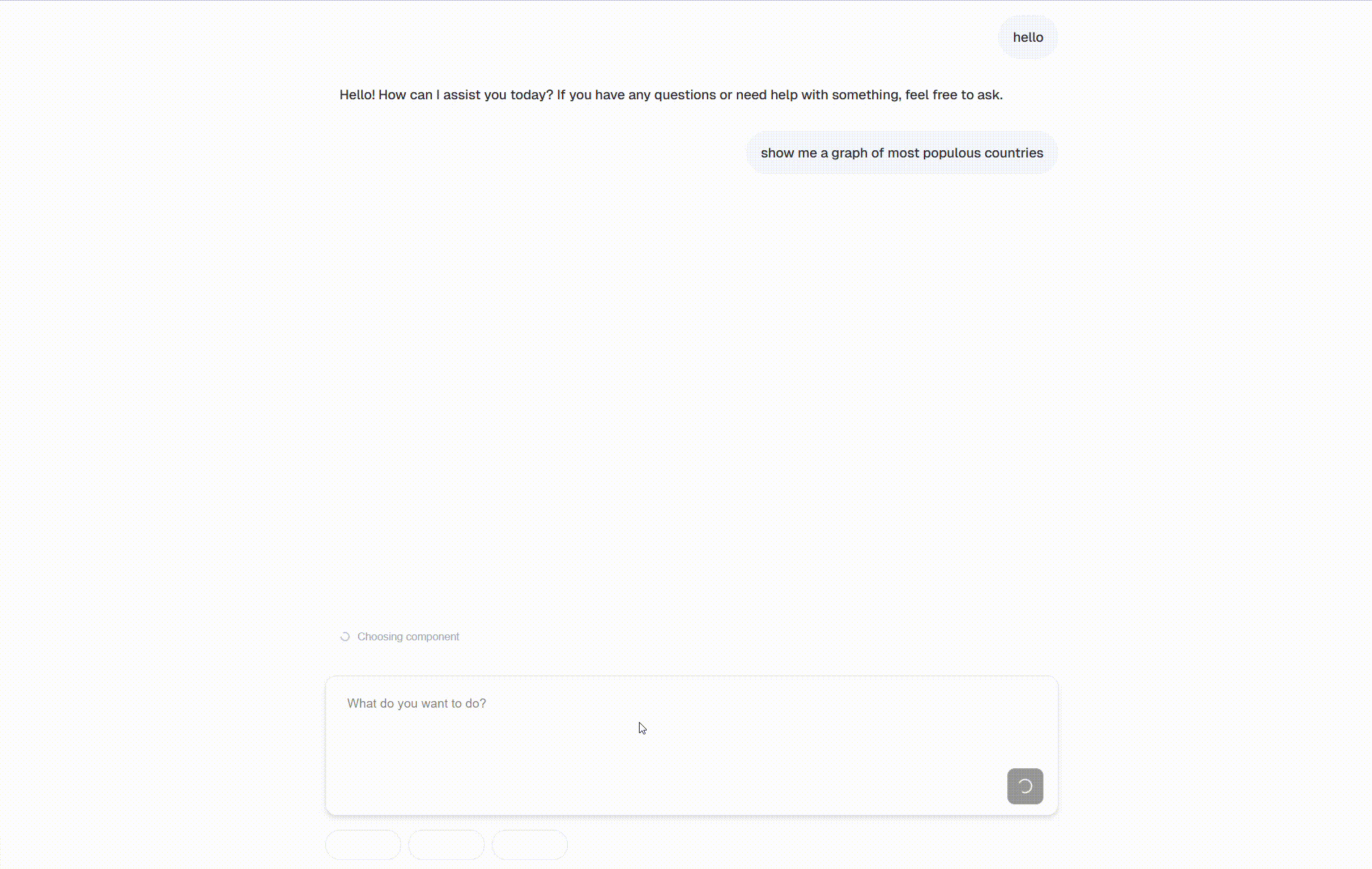
Supabase MCP Client App URL: /examples-and-templates/supabase-mcp-client Add MCP server tools and UI tools to a React app using tambo to build an AI app with minimal custom code. Use this as a starting point to build apps to interact with any MCP server. Demo GIF 
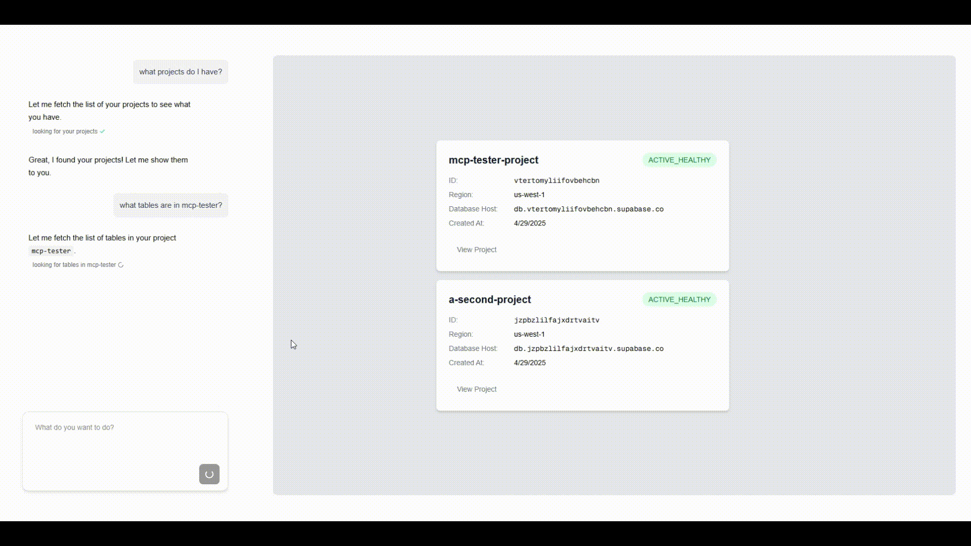
[Github](https://github.com/tambo-ai/supabase-mcp-client/tree/main?tab=readme-ov-file#supabase-mcp-client-react-app) This application makes use of tambo's `TamboMcpProvider` to easily add the tools defined by the official [Supabase MCP server](https://github.com/supabase-community/supabase-mcp). Custom react components to show interactive visualizations of the responses from the Supabase tools are registered with tambo in [src/lib/tambo.ts](https://github.com/tambo-ai/supabase-mcp-client/blob/main/src/lib/tambo.ts) # Suggestions URL: /concepts/suggestions Tambo automatically analyzes user interactions and generates contextual suggestions after each assistant message. You can also override these with custom suggestions using the `useTamboContextAttachment` hook. ## Using Suggestions ### The useTamboSuggestions Hook The main way to interact with suggestions is through the `useTamboSuggestions` hook: ```tsx title="thread-with-suggestions.tsx" import { useTamboSuggestions } from "@tambo-ai/react"; function ThreadWithSuggestions() { const { suggestions, // Array of current suggestions isLoading, // Whether suggestions are being generated or loading isAccepting, // Whether a suggestion is being applied error, // Current error message, if any accept, // Function to apply a suggestion } = useTamboSuggestions({ maxSuggestions: 3, // Optional: Number of suggestions to generate (1-10) }); if (isLoading) return ; if (error) return {error}; return (
{suggestions.map((suggestion) => ( ))}
); } ``` ### Hook Configuration The `useTamboSuggestions` hook accepts an optional configuration object: ```tsx title="thread-with-suggestions.tsx" interface UseTamboSuggestionsOptions { /** Maximum number of suggestions to generate (1-10, default 3) */ maxSuggestions?: number; } ``` ### When Suggestions Appear Suggestions are automatically generated after each assistant (tambo) message in the thread. The hook manages: * Loading states while generating suggestions * Error handling for failed generations * Automatic cleanup when messages change ### Accepting Suggestions The `accept` function provides two modes: ```tsx title="thread-with-suggestions.tsx" // Just set the suggestion text in the input accept(suggestion); // Set text and automatically submit accept(suggestion, true); ``` ## Suggestion Types ### Basic Suggestion Structure ```tsx title="thread-with-suggestions.tsx" interface Suggestion { /** Unique identifier for the suggestion */ id: string; /** Short title or summary of the suggestion */ title: string; /** Detailed explanation of the suggestion */ detailedSuggestion: string; /** ID of the message this suggestion is for */ messageId: string; /** Additional metadata for the suggestion */ metadata?: Record; } ``` ### State Management Types The hook uses additional types for state management: ```tsx title="thread-with-suggestions.tsx" type SuggestionState = { /** List of current suggestions */ items: Suggestion[]; /** Whether suggestions are currently being loaded */ loading: boolean; /** Current error message, if any */ error: string | null; }; ``` ## Error Handling The hook provides built-in error handling for common scenarios: ```tsx title="thread-with-suggestions.tsx" const ERROR_MESSAGES = { GENERATION: "Unable to generate suggestions right now", EMPTY: "No suggestions available for this message", ACCEPT: "Unable to apply suggestion, please try again", API_ERROR: "Failed to communicate with tambo", }; ``` ## Integration Example Here's a complete example showing how to integrate suggestions with a message thread: ```tsx title="thread-with-suggestions.tsx" import { useTamboThread, useTamboSuggestions } from "@tambo-ai/react"; function MessageThread() { const { thread } = useTamboThread(); const { suggestions, isLoading, isAccepting, error, accept } = useTamboSuggestions(); // Get the latest message const latestMessage = thread.messages[thread.messages.length - 1]; const isLatestFromHydra = latestMessage?.role === "assistant"; return (
{/* Messages */} {thread.messages.map((message) => (
{message.content}
))} {/* Suggestions (only shown after tambo messages) */} {isLatestFromHydra && (
{isLoading && } {error && {error}} {suggestions.map((suggestion) => ( ))}
)}
); } ``` Suggestions are automatically generated for each tambo message when the `useTamboSuggestions` hook is used. You don't need to manually trigger suggestion generation. ## Custom Suggestions You can override auto-generated suggestions with your own custom suggestions using the `useTamboContextAttachment` hook: ```tsx import { useTamboContextAttachment } from "@tambo-ai/react"; function ComponentSelector({ component }) { const { setCustomSuggestions } = useTamboContextAttachment(); const handleSelectComponent = () => { setCustomSuggestions([ { id: "1", title: "Edit this component", detailedSuggestion: `Modify the ${component.name} component`, messageId: "", }, { id: "2", title: "Add a feature", detailedSuggestion: `Add a new feature to ${component.name}`, messageId: "", }, ]); }; return ; } ``` To clear custom suggestions and return to auto-generated ones: ```tsx const { setCustomSuggestions } = useTamboContextAttachment(); setCustomSuggestions(null); ``` Custom suggestions are particularly useful when combined with [context attachments](/concepts/additional-context/context-attachments) to provide focused, contextual actions based on what the user is currently viewing or working on. # Components URL: /getting-started/components ## Component Library Our component library provides ready-to-use UI elements specifically designed for AI interactions: * Chat interfaces * Message threads * Input fields * Response indicators * Suggestion buttons * and Generative UI components ## Explore Our Components For a complete showcase of all available components, interactive examples, and implementation guides, visit our dedicated component site: Explore our full component library at ui.tambo.co ## Try our CLI command The quickest way to add Tambo components to your project is with our CLI: ```bash npx tambo full-send ``` This will install a set of common components and hook them up to Tambo in your project. For more customization options and advanced component usage, refer to the component documentation at [ui.tambo.co](https://ui.tambo.co). import { Card, Cards } from "fumadocs-ui/components/card"; # Integrate URL: /getting-started/integrate This example assumes an application using NextJs, but NextJs is not required. If you have an existing React application and want to add Tambo functionality, follow these steps: ### Step 1: Install tambo-ai ```bash npx tambo full-send ``` This command will: * Setup Tambo in your existing project and get you an API key * Install components that are hooked up to tambo-ai * Show you how to wrap your app with the `` If you prefer manual setup, you can run `npx tambo init` which will just get you set up with an API key. If you don't have an account yet, sign up for free first. ### Step 2: Add the TamboProvider Once the installation completes, update your `src/app/layout.tsx` file to enable Tambo: ```tsx title="src/app/layout.tsx" "use client"; import { TamboProvider } from "@tambo-ai/react"; export default function RootLayout({ children, }: { children: React.ReactNode; }) { return ( {children} ); } ``` You need to create a `.env.local` file in the root of your project to store your Tambo API key: `NEXT_PUBLIC_TAMBO_API_KEY=your_api_key_here` Replace `your_api_key_here` with the actual API key you received during setup. This file should not be committed to version control as it contains sensitive information. Note that the `TamboProvider` only works in the browser. On Next.js, specify `"use client"` at the top of your file to ensure that the `TamboProvider` is rendered in the browser. ### Step 3: Add the MessageThreadCollapsible component The `` component that the `full-send` command installed provides a complete chat interface for your AI assistant. Here's how to add it to your `src/app/page.tsx` file: ```tsx title="src/app/page.tsx" "use client"; import { MessageThreadCollapsible } from "../source/components/message-thread-collapsible"; export default function Home() { return (
); } ``` ### Run your app ```bash npm run dev ``` When you are done, you should see a chat interface like this:
# Start Here URL: /getting-started/quickstart Download and run our generative UI chat template to get an understanding of the fundamental features of Tambo. This application will show you how to build generative UI, integrate tools, send messages to Tambo, and stream responses. import { ImageZoom } from "fumadocs-ui/components/image-zoom"; ### Template Installation #### 1. Download the code ```bash title="Create and navigate to your project" npm create tambo-app@latest my-tambo-app && cd my-tambo-app ``` This will copy the source code of the template app into your directory and install the dependencies. See the source repo [here.](https://github.com/tambo-ai/tambo-template) #### 2. Get a Tambo API key ```bash title="Initialize Tambo" npx tambo init ``` To send messages to Tambo, you need to create a Project through Tambo and generate an API key to send with requests. This command will walk you through the setup of your first Tambo project, generate an API key, and set the API key in your project automatically. #### 3. Run the app ```bash title="Run the app" npm run dev ``` Start the app and go to `localhost:3000` in your browser to start sending messages to Tambo! ### Customize To get a better understanding of what's happening in this application, try to make a change to update Tambo's capabilities. In `/src/lib/tambo.ts` you'll see how the template registers components and tools with Tambo. In `/src/app/chat/page.tsx` you'll see how those tools and components are passed to the `TamboProvider` to 'register' them. #### Add a component Let's create and register a new component with Tambo to give our AI chat a new feature. In `src/components` create a new file called `recipe-card.tsx` and paste the following code into it: ```tsx title="recipe-card.tsx" "use client"; import { ChefHat, Clock, Minus, Plus, Users } from "lucide-react"; import { useState } from "react"; interface Ingredient { name: string; amount: number; unit: string; } interface RecipeCardProps { title?: string; description?: string; ingredients?: Ingredient[]; prepTime?: number; // in minutes cookTime?: number; // in minutes originalServings?: number; } export default function RecipeCard({ title, description, ingredients, prepTime = 0, cookTime = 0, originalServings, }: RecipeCardProps) { const [servings, setServings] = useState(originalServings || 1); const scaleFactor = servings / (originalServings || 1); const handleServingsChange = (newServings: number) => { if (newServings > 0) { setServings(newServings); } }; const formatTime = (minutes: number) => { if (minutes < 60) { return `${minutes}m`; } const hours = Math.floor(minutes / 60); const remainingMinutes = minutes % 60; return remainingMinutes > 0 ? `${hours}h ${remainingMinutes}m` : `${hours}h`; }; const totalTime = prepTime + cookTime; return (

{title}

{description}

{formatTime(totalTime)}
{servings} servings
{prepTime > 0 && (
Prep: {formatTime(prepTime)}
)}
Adjust Servings:
{servings}

Ingredients

    {ingredients?.map((ingredient, index) => (
  • {(ingredient.amount * scaleFactor).toFixed( (ingredient.amount * scaleFactor) % 1 === 0 ? 0 : 1, )} {ingredient.unit} {ingredient.name}
  • ))}
); } ``` Register it with Tambo by updating the `components` array in `src/lib/tambo.ts` with the following entry: ```tsx title="tambo.ts" { name: "RecipeCard", description: "A component that renders a recipe card", component: RecipeCard, propsSchema: z.object({ title: z.string().describe("The title of the recipe"), description: z.string().describe("The description of the recipe"), prepTime: z.number().describe("The prep time of the recipe in minutes"), cookTime: z.number().describe("The cook time of the recipe in minutes"), originalServings: z .number() .describe("The original servings of the recipe"), ingredients: z .array( z.object({ name: z.string().describe("The name of the ingredient"), amount: z.number().describe("The amount of the ingredient"), unit: z.string().describe("The unit of the ingredient"), }) ) .describe("The ingredients of the recipe"), }), }, ``` Now refresh the browser page and send a message like "Show me a recipe" and you should see Tambo generate and stream in an instance of your `RecipeCard` component. #### Add a tool You might notice that when using our added `RecipeCard` component above, Tambo generates recipe data completely from scratch. To allow Tambo to retrieve the list of ingredients we actually have, we can add a tool to get them. In `src/lib/tambo.ts` add the following entry to the 'tools' array: ```tsx title="tambo.ts" { name: "get-available-ingredients", description: "Get a list of all the available ingredients that can be used in a recipe.", tool: () => [ "pizza dough", "mozzarella cheese", "tomatoes", "basil", "olive oil", "chicken breast", "ground beef", "onions", "garlic", "bell peppers", "mushrooms", "pasta", "rice", "eggs", "bread", ], toolSchema: z.function().returns(z.array(z.string())), }, ``` Now refresh the browser page and send a message like "Show me a recipe I can make" and you should see Tambo look for the available ingredients and then generate a `RecipeCard` using them. ### Going Further This template app just scratches the surface of what you can build with Tambo. By using Tambo in creative ways you can make truly magical custom user experiences! # Custom LLM Parameters URL: /models/custom-llm-parameters Tambo uses an LLM behind the scenes to process user messages. You can change what model Tambo uses, and while Tambo uses certain parameters by default when calling the LLM, you can override these parameters to customize behavior depending on your chosen provider. Custom parameters are available for **OpenAI-compatible providers**. Other providers (OpenAI, Anthropic, etc.) are limited to common parameters for compatibility. ## How Does It Work? Custom LLM parameters allow you to override default model settings with provider-specific configurations. Parameters are stored per model, letting you optimize different models independently. **Example configuration:** * `temperature`: 0.7 * `maxOutputTokens`: 1000 * `topP`: 0.9 * `presencePenalty`: 0.1 ## Why Use Custom LLM Parameters? * **Fine-tune output quality** - Control randomness, length, and creativity * **Optimize for use cases** - Different parameters for creative writing vs. code generation * **Provider compatibility** - Support both standard and custom parameters * **Model-specific tuning** - Configure each model independently ## Configuring Parameters in the Dashboard All LLM parameters are configured through your project settings in the dashboard. ### Step 1: Access Provider Settings 1. Navigate to your project in the dashboard 2. Go to **Settings** → **LLM Providers** 3. Select your provider and model ### Step 2: Add Parameters The dashboard shows suggested parameters based on your selected model: **For Common Parameters:** 1. Under **Custom LLM Parameters**, you'll see suggested parameters like `temperature`, `maxOutputTokens`, `topP`, etc. 2. Click **+ temperature** (or any other parameter) to add it 3. Enter the value (e.g., `0.7` for temperature) 4. Click **Save** to apply the configuration **For Custom Parameters (OpenAI-Compatible Only):** 1. If you don't see the parameter you need in the suggestions, you can add custom parameters 2. Click to add a parameter manually 3. Enter the parameter name (e.g., `max_tokens`, `logit_bias`) 4. Enter the value in the appropriate format (string, number, boolean, array, or object) 5. Click **Save** to apply The dashboard automatically shows relevant parameter suggestions based on your selected provider and model. These suggestions include common parameters that work across all providers. ### Example Configuration **Setting up a creative writing model:** 1. Select your provider and model 2. Click **+ temperature** → Enter `0.9` 3. Click **+ topP** → Enter `0.95` 4. Click **+ presencePenalty** → Enter `0.6` 5. Click **+ maxOutputTokens** → Enter `2000` 6. Click **Save** ## Basic Parameters ### Common Parameters (All Providers) These are the parameters **supported by tambo** and **suggested for use** across all LLM providers. For providers other than OpenAI-compatible, users can **only use these common parameters** - custom parameters are not available. These parameters are supported across all tambo providers: | Parameter | Type | Description | Range/Example | | ---------------------- | ------ | -------------------------------------------------------------------------------------------------------------- | ----------------------------------------------- | | **`temperature`** | number | Controls randomness in output. Lower values for deterministic responses, higher values for creative responses. | `0.0-0.3` (deterministic), `0.7-1.0` (creative) | | **`maxOutputTokens`** | number | Maximum number of tokens to generate. Helps control response length and costs. | `100-4000` (varies by model) | | **`maxRetries`** | number | Number of retry attempts for failed API calls. | `1-5` | | **`topP`** | number | Nucleus sampling threshold. Alternative to temperature for controlling randomness. | `0.0-1.0` | | **`topK`** | number | Top-K sampling limit. Restricts sampling to top K most likely tokens. | `1-100` | | **`presencePenalty`** | number | Penalty for introducing new topics. Higher values encourage staying on topic. | `-2.0 to 2.0` | | **`frequencyPenalty`** | number | Penalty for token repetition. Higher values reduce repetitive text. | `-2.0 to 2.0` | | **`stopSequences`** | array | Array of strings that stop generation when encountered. | `["\n", "###"]` | | **`seed`** | number | Random seed for deterministic sampling. Same seed + prompt = same output. | Any integer | | **`headers`** | object | Custom HTTP headers for requests. | `{"Authorization": "Bearer token"}` | While these parameters are supported across all tambo providers, **tambo does not guarantee specific model behavior** when using these parameters. Different models may interpret the same parameter values differently, and results can vary based on the model, prompt, and context. Always test parameter combinations with your specific use case. ### Parameter Data Types | Type | Description | Examples | | ----------- | ----------------- | ------------------------------------------ | | **string** | Text values | `"stop"`, `"You are a helpful assistant"` | | **number** | Numeric values | `0.7`, `1000` | | **boolean** | True/false values | `true`, `false` | | **array** | JSON arrays | `["\n", "###"]`, `[1, 2, 3]` | | **object** | JSON objects | `{"key": "value"}`, `{"temperature": 0.5}` | ## OpenAI-Compatible Providers OpenAI-compatible providers support both **suggested parameters** (the common parameters above) and **custom parameters** for advanced use cases. ### Suggested Parameters for OpenAI-Compatible All common parameters listed above are available as suggestions for OpenAI-compatible providers. ### Custom Parameters for OpenAI-Compatible For full flexibility with OpenAI-compatible APIs, you can add any custom parameter supported by the provider. These parameters are configured through the tambo UI and passed directly to the OpenAI-compatible API. #### Available Custom Parameters These are examples of custom parameters that may be supported by OpenAI-compatible providers following OpenAI's API: | Parameter | Type | Description | | ---------------- | ------- | --------------------------------------------------- | | **`max_tokens`** | number | Alternative to `maxOutputTokens` | | **`logit_bias`** | object | Modify token probabilities (e.g., `{"1234": -100}`) | | **`user`** | string | End-user identifier for monitoring | | **`suffix`** | string | Text to append after completion | | **`logprobs`** | number | Include log probabilities in response | | **`echo`** | boolean | Include prompt in completion | | **`best_of`** | number | Generate multiple completions, return best | When adding custom parameters, **results are not guaranteed**. Different OpenAI-compatible providers may interpret or support these parameters differently. The examples above are suggestions only—always verify with your specific provider's documentation and test thoroughly before production use. ## Advanced Usage Patterns ### Creative Writing Model * `temperature`: 0.9 (high creativity) * `topP`: 0.95 (diverse word choices) * `presencePenalty`: 0.6 (encourage new topics) * `maxOutputTokens`: 2000 (longer responses) ### Code Generation Model * `temperature`: 0.2 (low randomness) * `topP`: 0.1 (focused word choices) * `frequencyPenalty`: 0.3 (reduce repetition) * `stopSequences`: \["\n\n", "###"] (stop at logical breaks) ### Deterministic Analysis Model * `temperature`: 0.0 (completely deterministic) * `seed`: 42 (reproducible results) * `maxOutputTokens`: 500 (controlled length) ### Custom OpenAI-Compatible Setup * `temperature`: 0.7 * `max_tokens`: 1000 * `logit_bias`: `{"50256": -100}` (modify token probabilities) * `user`: "analytics-user" (for monitoring) * `presence_penalty`: 0.1 ## Integration with Projects Parameters are configured per project and stored with the following hierarchy: * **Provider** (e.g., "openai", "openai-compatible") * **Model** (e.g., "gpt-4", "claude-3-sonnet", "custom-model-v1") * **Parameters** (key-value configuration) This allows different projects to have different parameter sets for the same model, enabling fine-tuned optimization across use cases. ## Best Practices * **Start with defaults**: Begin with suggested parameters before adding custom ones * **Test incrementally**: Change one parameter at a time to understand effects * **Document configurations**: Note which parameter sets work best for specific use cases * **Monitor usage**: Higher token limits and retries can increase API costs * **Use custom parameters sparingly**: Only for OpenAI-compatible providers when needed ## Troubleshooting **Parameters not applying?** * Verify you're using an OpenAI-compatible provider for custom parameters * Check parameter syntax matches the expected type (string/number/boolean/array/object) **Model not responding as expected?** * Lower temperature values (0.0-0.3) for more deterministic responses * Adjust `topP` and `topK` for fine-grained control over randomness * Use `stopSequences` to prevent rambling responses **API errors with custom parameters?** * Ensure custom parameter names match the provider's API documentation * Verify parameter values are within acceptable ranges * Check that the provider supports the custom parameter you're trying to use # Labels URL: /models/labels Streaming may behave inconsistently in models other than **OpenAI**. We're aware of the issue and are actively working on a fix. Please proceed with caution when using streaming on non-OpenAI models. Models in tambo carry a **status label**, shown when you select a model from the LLM settings\ (**Dashboard → Project → Settings → LLM Providers**). ### Why Use Labels? * **Set expectations**: Understand tambo’s confidence level for each model. * **Guide selection**: Prefer `tested` models for production; approach others with care. * **Highlight caveats**: `known-issues` labels call out specific behaviors we've observed. ### Label Definitions | Label | Meaning | | -------------- | ------------------------------------------------------------------ | | `tested` | Validated on common tambo tasks. Recommended for most workflows. | | `untested` | Available, but not yet validated. Use it—but test in your context. | | `known-issues` | Usable, but we’ve observed behaviors worth noting (see below). | ### Observed Behaviors & Notes These behaviors were noted during testing on common tambo tasks. The models below are still usable—just keep the caveats in mind. #### Google * **Gemini 2.5 Pro / 2.5 Flash / 2.0 Flash / 2.0 Flash Lite**: * May occasionally resist rendering as requested. Sometimes it completes the request, but behavior can be inconsistent. * Try clarifying instructions (e.g., “Return a bulleted list only”). * Outputs may have formatting quirks. Be cautious when structure matters. #### Anthropic * **Claude 3.5 Haiku**: * May fail to fully render components, even when receiving the correct data. * *Example:* When rendering a graph component, it may leave it in a loading state without streaming the data into props. #### Mistral * **Mistral Large 2.1 / Medium 3**: * Similar to Gemini, may inconsistently follow rendering instructions. * Try clarifying the prompt structure. * Formatting idiosyncrasies can occur—validate outputs where structure is important. For production-critical formatting, use **Tested** models and validate outputs. When using **Untested** or **Known Issues** models, run a small prompt suite to check behavior in your specific workload. ### Usage Patterns * **Prefer `tested`** models for reliability. If using others, test with your use case. * **Use inline notes** in the picker to spot caveats quickly. ### Integration You can change providers and models at the project level under **LLM Provider Settings**. tambo will apply your token limits and defaults accordingly. # Reasoning Models URL: /models/reasoning-models Reasoning models are specialized LLMs that expose their internal thought process before generating a final response. These models excel at complex tasks requiring multi-step reasoning, problem-solving, and logical analysis by spending additional compute time "thinking" through the problem. You can add reasoning parameters through your project's LLM provider settings. Tambo currently supports reasoning capabilities for **OpenAI models** (GPT-5, GPT-5 Mini, GPT-5 Nano, O3) and **Google Gemini models** (2.5 Pro, 2.5 Flash). Each provider uses different parameter names to control reasoning behavior. ## What Are Reasoning Models? Traditional LLMs generate responses token-by-token in a single forward pass. Reasoning models add an intermediate "thinking" phase where the model: 1. **Analyzes the problem** - Breaks down complex queries into sub-problems 2. **Explores solutions** - Considers multiple approaches and their tradeoffs 3. **Verifies reasoning** - Checks its logic before committing to an answer 4. **Generates response** - Produces the final output based on verified reasoning This thinking process is captured as **reasoning tokens** that you can access, display, and analyze alongside the final response. ## Supported Models ### OpenAI Models OpenAI's reasoning models expose their thought process through dedicated parameters: | Model | Description | | -------------- | --------------------------------------------- | | **GPT-5** | Latest flagship model with advanced reasoning | | **GPT-5 Mini** | Faster, cost-effective reasoning model | | **GPT-5 Nano** | Smallest, most efficient reasoning model | | **O3** | Specialized reasoning model | **OpenAI Reasoning Parameters:** | Parameter | Type | Description | Values | | ------------------ | ------ | --------------------------------------- | ------------------------------------------ | | `reasoningEffort` | string | Controls intensity of reasoning process | `"minimal"`, `"low"`, `"medium"`, `"high"` | | `reasoningSummary` | string | Enables reasoning token output | `"auto"`, `"detailed"` | ### Google Gemini Models Gemini models use a "thinking budget" approach to control reasoning: | Model | Description | | -------------------- | ------------------------------------------------ | | **gemini-2.5-pro** | Most capable Gemini model with extended thinking | | **gemini-2.5-flash** | Fast, efficient reasoning for production use | **Gemini Reasoning Parameters:** | Parameter | Type | Description | | -------------------------------- | ------- | --------------------------------------- | | `thinkingConfig` | object | Configuration for thinking behavior | | `thinkingConfig.thinkingBudget` | number | Token budget allocated for thinking | | `thinkingConfig.includeThoughts` | boolean | Whether to include thinking in response | ## Configuring Reasoning in the Dashboard Reasoning parameters are configured in your project's LLM provider settings on the dashboard. Here's how to set them up: ### Step 1: Access Provider Settings 1. Navigate to your project in the dashboard 2. Go to **Settings** → **LLM Providers** 3. Select your provider and model that supports reasoning ### Step 2: Configure OpenAI Reasoning Parameters For OpenAI models (GPT-5, GPT-5 Mini, GPT-5 Nano, O3): 1. Under **Custom LLM Parameters**, you'll see suggested parameters 2. Click **+ reasoningEffort** to add it 3. Set the value to control reasoning intensity: * **`"low"`** - Quick reasoning for simple tasks (faster, cheaper) * **`"medium"`** - Balanced reasoning for most use cases (recommended) * **`"high"`** - Deep reasoning for complex problems (slower, more expensive) 4. Click **+ reasoningSummary** to add it 5. Set the value to **`"auto"`** to receive reasoning tokens in responses 6. Click **Save** to apply the configuration When you select an OpenAI reasoning model, the dashboard automatically shows **reasoningEffort** and **reasoningSummary** as suggested parameters. Just click them to add! ### Step 3: Configure Gemini Reasoning Parameters For Gemini models (2.5 Pro, 2.5 Flash): 1. Under **Custom LLM Parameters**, look for the **+ thinkingConfig** suggestion 2. Click **+ thinkingConfig** to add it 3. Configure the thinking behavior with a JSON object: ```json { "thinkingBudget": 5000, "includeThoughts": true } ``` 4. Set **`thinkingBudget`** based on your needs: * **1000-2000**: Quick reasoning for simple tasks * **3000-5000**: Standard reasoning for most use cases (recommended) * **7000+**: Extended reasoning for complex problems 5. Set **`includeThoughts`** to **`true`** to receive thinking tokens 6. Click **Save** to apply the configuration When you select a Gemini reasoning model, the dashboard automatically shows **thinkingConfig** as a suggested parameter. Just click it to add! ### Example Configurations **OpenAI - Balanced Reasoning:** * Parameter: `reasoningEffort` → Value: `"medium"` * Parameter: `reasoningSummary` → Value: `"auto"` **OpenAI - Deep Reasoning:** * Parameter: `reasoningEffort` → Value: `"high"` * Parameter: `reasoningSummary` → Value: `"auto"` **Gemini - Standard Reasoning:** * Parameter: `thinkingConfig` → Value: `{"thinkingBudget": 5000, "includeThoughts": true}` **Gemini - Extended Reasoning:** * Parameter: `thinkingConfig` → Value: `{"thinkingBudget": 8000, "includeThoughts": true}` ## When to Use Reasoning Models Reasoning models work best for tasks that benefit from step-by-step thinking: **✅ Best for:** * Complex problem-solving and analysis * Mathematical calculations and proofs * Code review and debugging * Strategic planning requiring multiple steps * Tasks where showing work builds user trust **⚠️ Not ideal for:** * Simple Q\&A or fact retrieval * Real-time chat requiring instant responses * High-volume, cost-sensitive applications ## Displaying Reasoning in Your App Tambo components automatically handle reasoning display - no additional code required. ### Built-in Support When you add Tambo components from the CLI, reasoning support is included out-of-the-box: ```bash npx tambo add message ``` These components include the `ReasoningInfo` sub-component that: * **Auto-displays** reasoning in a collapsible dropdown * **Shows thinking progress** with step counts during streaming * **Auto-collapses** when the final response arrives * **Auto-scrolls** to follow reasoning as it streams If you're using Tambo's pre-built components (message, thread-content, message-thread-full, etc.), reasoning display is already built-in. Just configure reasoning parameters in your dashboard and it works automatically. ### Custom Implementation If building custom components, reasoning is available in the `ThreadMessage` type: ```typescript interface ThreadMessage { id: string; content: string; role: "user" | "assistant"; reasoning?: string[]; // Array of reasoning strings // ... other fields } ``` Access it like any other message property: ```tsx { message.reasoning?.map((step, index) => (
Step {index + 1}: {step}
)); } ``` ## Best Practices ### Performance Optimization **Balance reasoning effort with cost and latency in your dashboard configuration:** **Development Environment:** * Use `reasoningEffort: "high"` for thorough testing * Enable `reasoningSummary: "auto"` to debug thinking process * Higher costs acceptable for development **Production Environment:** * Use `reasoningEffort: "medium"` for balanced performance * Enable `reasoningSummary: "auto"` to maintain reasoning capabilities * Optimize for cost-performance balance **High-Volume Applications:** * Use `reasoningEffort: "low"` or disable reasoning parameters * Consider using non-reasoning models for simple queries * Monitor token usage and costs closely ### Cost Considerations Reasoning tokens are billed separately and typically cost more than standard tokens: * **Monitor usage** - Track reasoning token consumption in your dashboard * **Optimize effort** - Use lower reasoning effort when appropriate * **Token budgets** - For Gemini, set appropriate `thinkingBudget` values based on task complexity ## Troubleshooting **Reasoning not appearing in responses?** * Verify you're using a supported model (GPT-5, GPT-5 Mini, GPT-5 Nano, O3, or Gemini 2.5) * Check your dashboard settings under **LLM Providers** → **Custom LLM Parameters** * For OpenAI: Ensure `reasoningSummary` is added and set to `"auto"` * For Gemini: Ensure `thinkingConfig` has `includeThoughts: true` * Click **Save Settings** after making changes **Reasoning tokens consuming too many resources?** * In your dashboard settings, lower `reasoningEffort` from `"high"` to `"medium"` or `"low"` * For Gemini models, reduce the `thinkingBudget` value in `thinkingConfig` * Create separate projects with different configurations for simple vs. complex queries * Monitor token usage in your Tambo Cloud usage dashboard * Consider using non-reasoning models for high-volume, simple tasks ## Additional Resources Reasoning parameters are part of Tambo's custom LLM parameter system. For information on configuring other model parameters, see [Custom LLM Parameters](/models/custom-llm-parameters). * **OpenAI Reasoning Models**: [OpenAI Documentation](https://platform.openai.com/docs/guides/reasoning) * **Gemini Thinking Config**: [Google AI Documentation](https://ai.google.dev/gemini-api/docs/thinking) * **Tambo Cloud GitHub**: [View Implementation](https://github.com/tambo-ai/tambo-cloud) # Tambo MCP Server URL: /tambo-mcp-server import { Tabs, Tab } from "fumadocs-ui/components/tabs"; Tambo's MCP server provides tools for an LLM to retrieve information from our documentation about how to use Tambo. Add our MCP server to your IDE to give your coding assistant knowledge of how to use Tambo. ## Quick Setup The fastest way to add tambo MCP to Cursor is by clicking the "Add to IDE" button on our homepage and selecting your preferred IDE. For other IDEs or manual setup, follow the instructions below. ## Setup Instructions 1. Click the install button on the homepage, or go directly to your global MCP configuration file at `~/.cursor/mcp.json`. 2. Add the following configuration: ```bash "mcpServers": { "tambo": { "url": "https://mcp.tambo.co/mcp" }, } ``` 4. Save the file 5. Restart Cursor **Claude Desktop** 1. Open Claude Desktop 2. Go to Settings (from the Claude menu) → Developer → Edit Config 3. Add the following configuration: ```bash "mcpServers": { "tambo": { "url": "https://mcp.tambo.co/mcp" }, } ``` 4. Save the file 5. Restart Claude Desktop **Claude Code** ```bash claude mcp add --transport sse tambo-server https://mcp.tambo.co/mcp ``` 1. Go to your global MCP configuration file at `.vscode/mcp.json`. 2. Add the following configuration: ```bash "servers": { "tambo": { "type": "http", "url": "https://mcp.tambo.co/mcp" } } ``` 4. Save the file 5. Restart VSCode 6. Alternatively, run the **MCP: Add Server** command from the Command Palette, choose the type of MCP server to add and provide the server information. Next, select Workspace Settings to create the `.vscode/mcp.json` file in your workspace if it doesn't already exist 1. Click the hammer icon (🔨) in Cascade 2. Click Configure to open \~/.codeium/windsurf/mcp\_config.json 3. Add the following configuration: ```bash "mcpServers": { "tambo": { "command": "npx", "args": ["-y", "mcp-remote", "https://mcp.tambo.co/mcp"] }, } ``` 4. Save the file 5. Click Refresh (🔄) in the MCP toolbar 1. Open settings with `Cmd + ,` 2. Add the following configuration: ```json { "context_servers": { "tambo": { "command": { "path": "npx", "args": ["-y", "mcp-remote", "https://mcp.tambo.co/mcp"], "env": {} }, "settings": {} } } } ``` ## Verification After setting up the MCP server, you can verify it's working: 1. Open a new chat or file 2. Try asking the AI assistant about tambo 3. Check the IDE's output/console for any error messages # add URL: /cli/commands/add `npx tambo add ` Adds a component hooked up to Tambo to your app. This command will install the component file directly into the `/components/tambo` directory of your app so you can easily customize the behavior and styles. It will also install the components' dependencies and update your styles. **Available Components:** * `message-thread-full` - Full-screen chat interface with history and typing indicators * `message-thread-panel` - Split-view chat with integrated workspace * `message-thread-collapsible` - Collapsible chat for sidebars * `control-bar` - Spotlight-style command palette * `form` - AI-powered form components * `graph` - Interactive graph visualization * `canvas-space` - Canvas workspace for visual AI interactions * `input-fields` - Smart input field components **Examples:** ```bash # Add a single component npx tambo add form # Add multiple components npx tambo add form graph canvas-space # Add to custom directory npx tambo add form --prefix=src/components/ui # Skip confirmation prompts npx tambo add form --yes # Use legacy peer deps (for dependency conflicts) npx tambo add form --legacy-peer-deps ``` ## Automatic Configuration The `add` command automatically configures your CSS and Tailwind setup based on your project's Tailwind CSS version: * **Detects your Tailwind version** (v3 or v4) automatically * **Updates your `globals.css`** with required CSS variables * **Updates your `tailwind.config.ts`** (v3 only) with basic configuration * **Preserves your existing styles** and configuration The CLI preserves your existing configuration and only adds what's needed for Tambo components to work. Your custom styles and colors won't be overridden. For detailed information about what gets configured or for manual setup, see: import { Card, Cards } from "fumadocs-ui/components/card"; Complete guide to CSS variables and Tailwind configuration changes # create-app URL: /cli/commands/create-app `npx tambo create-app [directory]` or `npm create tambo-app my-app` Creates a new Tambo app from a template. Choose from pre-built templates to get started quickly with different use cases. **Available Templates:** * `standard` - Tambo + Tools + MCP - general purpose AI app template with MCP integration * `analytics` - Generative UI analytics template with drag-and-drop canvas and data visualization * More templates coming soon! **Examples:** ```bash # Create app with interactive prompts npx tambo create-app # Create in current directory npx tambo create-app . # Create with specific template npx tambo create-app my-app --template=mcp # Initialize git repository automatically npx tambo create-app my-app --init-git # Use legacy peer deps npx tambo create-app my-app --legacy-peer-deps ``` **Manual Setup After Creating:** ```bash cd my-app npx tambo init # Complete setup with API key npm run dev # Start development server ``` # full-send URL: /cli/commands/full-send `npx tambo full-send` For instant project setup, performs the same project setup steps as `init`, and also installs a few useful components. **What it does:** 1. Sets up authentication and API key 2. Creates the `lib/tambo.ts` configuration file 3. Prompts you to select starter components to install 4. Installs selected components and their dependencies 5. Provides setup instructions with code snippets **Examples:** ```bash # Full setup with component selection npx tambo full-send # Skip prompts and use defaults npx tambo full-send --yes # Use legacy peer deps npx tambo full-send --legacy-peer-deps ``` **Manual Provider Setup:** After running `full-send`, add the TamboProvider to your layout file: ```tsx title="app/layout.tsx" "use client"; import { TamboProvider } from "@tambo-ai/react"; import { components } from "../lib/tambo"; import { MessageThreadFull } from "@/components/tambo/message-thread-full"; export default function Layout({ children }) { return (
{children}
); } ``` ## Manual Styling Setup The `full-send` command automatically configures your CSS and Tailwind based on your version. If you need to manually verify or update the configuration: ### Tailwind CSS v3 Configuration **Check your `globals.css` file includes:** ```css title="app/globals.css" @tailwind base; @tailwind components; @tailwind utilities; @layer base { :root { /* Tailwind CSS Variables customized with Tambo colors */ --background: 0 0% 100%; --foreground: 240 10% 3.9%; --card: 0 0% 100%; --card-foreground: 240 10% 3.9%; --popover: 0 0% 100%; --popover-foreground: 240 10% 3.9%; --primary: 235 12% 21%; --primary-foreground: 0 0% 98%; --secondary: 218 11% 46%; --secondary-foreground: 0 0% 100%; --muted: 217 14% 90%; --muted-foreground: 217 14% 68%; --accent: 240 4.8% 95.9%; --accent-foreground: 240 5.9% 10%; --destructive: 0 84.2% 60.2%; --border: 207 22% 90%; --input: 240 5.9% 90%; --ring: 240 10% 3.9%; --chart-1: 30 80% 54.9%; --chart-2: 339.8 74.8% 54.9%; --chart-3: 219.9 70.2% 50%; --chart-4: 160 60% 45.1%; --chart-5: 280 64.7% 60%; /* Tambo-specific variables for component layouts */ --radius: 0.5rem; --container: 210 29% 97%; --backdrop: 210 88% 14% / 0.25; --muted-backdrop: 210 88% 14% / 0.1; --panel-left-width: 500px; --panel-right-width: 500px; --sidebar-width: 3rem; } .dark { /* Dark mode variables */ --background: 240 10% 3.9%; --foreground: 0 0% 98%; --card: 240 10% 3.9%; --card-foreground: 0 0% 98%; --popover: 240 10% 3.9%; --popover-foreground: 0 0% 98%; --primary: 0 0% 98%; --primary-foreground: 240 5.9% 10%; --secondary: 240 3.7% 15.9%; --secondary-foreground: 0 0% 98%; --muted: 240 3.7% 15.9%; --muted-foreground: 240 5% 64.9%; --accent: 240 3.7% 15.9%; --accent-foreground: 0 0% 98%; --destructive: 0 62.8% 30.6%; --border: 240 3.7% 15.9%; --input: 240 3.7% 15.9%; --ring: 240 4.9% 83.9%; --chart-1: 30 80% 54.9%; --chart-2: 339.8 74.8% 54.9%; --chart-3: 219.9 70.2% 50%; --chart-4: 160 60% 45.1%; --chart-5: 280 64.7% 60%; /* Tambo-specific variables for component layouts */ --radius: 0.5rem; --container: 210 29% 97%; --backdrop: 210 88% 14% / 0.25; --muted-backdrop: 210 88% 14% / 0.1; --panel-left-width: 500px; --panel-right-width: 500px; --sidebar-width: 3rem; } } ``` **Verify your `tailwind.config.ts` includes:** ```tsx title="tailwind.config.ts" import type { Config } from "tailwindcss"; const config: Config = { darkMode: "class", content: [ "./pages/**/*.{ts,tsx}", "./components/**/*.{ts,tsx}", "./app/**/*.{ts,tsx}", "./src/**/*.{ts,tsx}", ], // ... your existing theme configuration }; export default config; ``` ### Tailwind CSS v4 Configuration **For v4, check your `globals.css` includes:** ```css title="app/globals.css" @import "tailwindcss"; @custom-variant dark (&:is(.dark *)); @theme inline { /* Color mappings for Tailwind v4 */ --color-background: var(--background); --color-foreground: var(--foreground); --color-card: var(--card); --color-card-foreground: var(--card-foreground); --color-popover: var(--popover); --color-popover-foreground: var(--popover-foreground); --color-primary: var(--primary); --color-primary-foreground: var(--primary-foreground); --color-secondary: var(--secondary); --color-secondary-foreground: var(--secondary-foreground); --color-muted: var(--muted); --color-muted-foreground: var(--muted-foreground); --color-accent: var(--accent); --color-accent-foreground: var(--accent-foreground); --color-destructive: var(--destructive); --color-border: var(--border); --color-input: var(--input); --color-ring: var(--ring); --color-chart-1: var(--chart-1); --color-chart-2: var(--chart-2); --color-chart-3: var(--chart-3); --color-chart-4: var(--chart-4); --color-chart-5: var(--chart-5); /* Tambo-specific color mappings */ --color-container: var(--container); --color-backdrop: var(--backdrop); --color-muted-backdrop: var(--muted-backdrop); } :root { /* Tailwind v4 uses oklch() color format */ --background: oklch(1 0 0); --foreground: oklch(0.14 0 285); --card: oklch(1 0 0); --card-foreground: oklch(0.14 0 285); --popover: oklch(1 0 0); --popover-foreground: oklch(0.14 0 285); --primary: oklch(0.31 0.02 281); --primary-foreground: oklch(0.98 0 0); --secondary: oklch(0.54 0.027 261); --secondary-foreground: oklch(1 0 0); --muted: oklch(0.92 0 260); --muted-foreground: oklch(0.73 0.022 260); --accent: oklch(0.97 0 286); --accent-foreground: oklch(0.21 0 286); --destructive: oklch(0.64 0.2 25); --border: oklch(0.93 0 242); --input: oklch(0.92 0 286); --ring: oklch(0.14 0 285); --chart-1: oklch(0.72 0.15 60); --chart-2: oklch(0.62 0.2 6); --chart-3: oklch(0.53 0.2 262); --chart-4: oklch(0.7 0.13 165); --chart-5: oklch(0.62 0.2 313); /* Tambo-specific layout variables */ --container: oklch(0.98 0 247); --backdrop: oklch(0.25 0.07 252 / 0.25); --muted-backdrop: oklch(0.25 0.07 252 / 0.1); --radius: 0.5rem; --panel-left-width: 500px; --panel-right-width: 500px; --sidebar-width: 3rem; } .dark { /* Dark mode with oklch() colors */ --background: oklch(0.145 0 0); --foreground: oklch(0.985 0 0); --card: oklch(0.205 0 0); --card-foreground: oklch(0.985 0 0); --popover: oklch(0.205 0 0); --popover-foreground: oklch(0.985 0 0); --primary: oklch(0.922 0 0); --primary-foreground: oklch(0.205 0 0); --secondary: oklch(0.269 0 0); --secondary-foreground: oklch(0.985 0 0); --muted: oklch(0.269 0 0); --muted-foreground: oklch(0.708 0 0); --accent: oklch(0.269 0 0); --accent-foreground: oklch(0.985 0 0); --destructive: oklch(0.704 0.191 22.216); --border: oklch(1 0 0 / 10%); --input: oklch(1 0 0 / 15%); --ring: oklch(0.556 0 0); --chart-1: oklch(0.72 0.15 60); --chart-2: oklch(0.62 0.2 6); --chart-3: oklch(0.53 0.2 262); --chart-4: oklch(0.7 0.13 165); --chart-5: oklch(0.62 0.2 313); /* Tambo-specific layout variables */ --container: oklch(0.98 0 247); --backdrop: oklch(0.25 0.07 252 / 0.25); --muted-backdrop: oklch(0.25 0.07 252 / 0.1); --radius: 0.5rem; --panel-left-width: 500px; --panel-right-width: 500px; --sidebar-width: 3rem; } @layer base { * { @apply border-border outline-ring/50; } body { @apply bg-background text-foreground; font-family: Arial, Helvetica, sans-serif; } } ``` The `full-send` command detects your Tailwind version and applies the appropriate CSS format automatically. You typically won't need to manually configure these files unless you're customizing the default Tambo styling. Tambo components require specific CSS variables to function properly. The layout variables (`--panel-left-width`, `--panel-right-width`, `--sidebar-width`) control component dimensions and should not be removed. For detailed information about what gets configured or for manual setup, see: import { Card, Cards } from "fumadocs-ui/components/card"; Complete guide to CSS variables and Tailwind configuration changes # init URL: /cli/commands/init `npx tambo init` Walks you through creating a Tambo project and getting your free API Key. If you don't already have an account, sign up for free to get your API key. After obtaining your API key, you'll need to set it up in your project: Create a `.env.local` file in the root of your project to store your Tambo API key: `NEXT_PUBLIC_TAMBO_API_KEY=your_api_key_here` Replace `your_api_key_here` with the actual API key you received during setup. This file should not be committed to version control as it contains sensitive information. **Examples:** ```bash # Interactive setup npx tambo init # Skip prompts and use defaults npx tambo init --yes # Use legacy peer deps npx tambo init --legacy-peer-deps ``` # list URL: /cli/commands/list `npx tambo list` Lists all installed Tambo components in your project, showing which components are in the current location (`/components/tambo`). **Examples:** ```bash # List all installed components npx tambo list # List components in custom directory npx tambo list --prefix=src/components/ui ``` ## Example Output When you run `npx tambo list`, you'll see output similar to this: ```bash $ npx tambo list Found existing src/ directory ? Would you like to use the existing src/ directory for components? yes ℹ Installed components: In tambo/: Tambo components: - canvas-space - control-bar - form - graph - input-fields - message-input - message-suggestions - message-thread-collapsible - message-thread-full - message-thread-panel - message - scrollable-message-container - thread-content - thread-dropdown - thread-history Tambo support components: - markdown-components - message-generation-stage - suggestions-tooltip - thread-container Total: 19 component(s) (19 from Tambo, 0 custom) ``` ### With Custom Directory If you're using a custom directory with `--prefix`, the output shows that location: ```bash $ npx tambo list --prefix=src/components/ui ℹ Installed components: In ui/: Tambo components: - message-thread-collapsible - control-bar - form Tambo support components: - markdown-components Total: 4 component(s) (4 from Tambo, 0 custom) ``` ### No Components Found If no components are installed, you'll see: ```bash $ npx tambo list ℹ No Tambo components found in components/tambo/ Get started by installing components: npx tambo add message-thread-full npx tambo add form graph ``` ## Understanding the Output The `list` command organizes components into two categories: ### Tambo Components These are the main UI components you can use in your application: * **Chat Components**: `message-thread-*`, `message-*`, `thread-*` * **Input Components**: `input-fields`, `form`, `control-bar` * **Visualization**: `graph`, `canvas-space` ### Tambo Support Components These are utility components that support the main Tambo components: * **Markdown Support**: `markdown-components` * **UI Helpers**: `message-generation-stage`, `suggestions-tooltip` * **Containers**: `thread-container`, `scrollable-message-container` The CLI automatically detects whether you're using a `src/` directory structure and will prompt you about component location preferences. It distinguishes between main Tambo components and supporting utility components. The total count shows both Tambo components and any custom components you may have added. This helps you track what's installed and identify any non-Tambo components in your Tambo directory. # migrate URL: /cli/commands/migrate `npx tambo migrate` Migrates Tambo components from the legacy `components/ui` directory to the new `components/tambo` directory and updates import paths automatically. This command addresses the change in Tambo CLI's installation approach - earlier versions installed components in `components/ui`, while current versions use the dedicated `components/tambo` directory for better organization. **What it does:** 1. Moves component files from `ui/` to `tambo/` directory 2. Updates import paths in moved files 3. Preserves custom (non-Tambo) components in original location 4. Shows preview of changes before applying **Examples:** ```bash # Preview migration changes (recommended first) npx tambo migrate --dry-run # Perform migration with confirmation npx tambo migrate # Skip confirmation prompts npx tambo migrate --yes ``` **Manual Migration Steps:** If you prefer to migrate manually: 1. **Move Files**: Move all `.tsx` files from `/components/ui/` to `/components/tambo/` 2. **Update Imports**: Change all imports from `@/components/ui/` to `@/components/tambo/` 3. **Update Registry**: Update component registrations in `lib/tambo.ts` 4. **Test**: Verify all components still work correctly # update URL: /cli/commands/update `npx tambo update ` or `npx tambo update installed` Updates specific Tambo components or all installed components to their latest versions from the registry. **Examples:** ```bash # Update specific components npx tambo update form graph # Update ALL installed components at once npx tambo update installed # Update with custom directory npx tambo update form --prefix=src/components/ui # Skip confirmation prompts npx tambo update installed --yes ``` ## CSS Configuration Updates When updating components, the CLI may also update your CSS variables and Tailwind configuration to ensure compatibility with the latest component versions. Component updates may require new CSS variables or Tailwind configuration changes. The CLI will detect your Tailwind version and apply the appropriate format automatically. For detailed information about what gets configured, see: import { Card, Cards } from "fumadocs-ui/components/card"; Learn what changes are made to your globals.css and tailwind.config files # upgrade URL: /cli/commands/upgrade `npx tambo upgrade` Upgrades your entire tambo project including npm packages, components, and cursor rules to the latest versions. **What it upgrades:** 1. **NPM Packages**: Updates known safe packages (UI components, utilities, and tambo dependencies) 2. **Components**: Updates all installed tambo components to latest versions 3. **Cursor Rules**: Updates AI coding assistant rules for better development experience 4. **Configuration**: Updates CSS variables and Tailwind configuration as needed **Examples:** ```bash # Interactive upgrade with prompts npx tambo upgrade # Auto-accept all changes npx tambo upgrade --accept-all # Upgrade with custom component directory npx tambo upgrade --prefix=src/components/ui # Use legacy peer deps npx tambo upgrade --legacy-peer-deps ``` ## Safe Package Updates The upgrade command only updates packages that are known to be safe for automatic updates: The CLI automatically filters to only show updates for UI components, utilities, and tambo-specific packages. Core framework packages (like React, Next.js, TypeScript) are excluded to prevent breaking changes. **Safe packages include:** * tambo packages (`@tambo-ai/react`, `@tambo-ai/typescript-sdk`) * UI components (`@radix-ui/*`, `framer-motion`, `lucide-react`) * Styling utilities (`tailwindcss`, `clsx`, `tailwind-merge`) * Development tools (`eslint-config-next`, selected @types packages such as `@types/dompurify`) ## Configuration Updates The upgrade command performs comprehensive updates to your project configuration: ### CSS & Tailwind Updates The CLI will update your `globals.css` and `tailwind.config.ts` files to ensure they're compatible with the latest tambo components and your current Tailwind CSS version. The upgrade process preserves your existing styles and configuration while adding any new CSS variables required by updated components. ### What Gets Updated * **CSS Variables**: New variables required by component updates * **Tailwind Configuration**: Basic configuration for v3 projects * **Component Dependencies**: Latest versions of all component dependencies * **Package Versions**: Updates to known safe packages only While the CLI creates automatic backups, consider committing your changes to version control before running `upgrade` to ensure you can easily revert if needed. For detailed information about configuration changes, see: import { Card, Cards } from "fumadocs-ui/components/card"; Complete guide to CSS variables and Tailwind configuration changes # Configuration URL: /concepts/additional-context/configuration Context helpers are most commonly configured at the app root using `TamboProvider`. You provide a plain object where each key is the context name and each value is a function that returns the context value (or null/undefined to skip). ## Basic Configuration (recommended) Configure prebuilt context helpers at the root: ```tsx import { TamboProvider } from "@tambo-ai/react"; import { currentTimeContextHelper, currentPageContextHelper, } from "@tambo-ai/react"; function AppRoot({ children }: { children: React.ReactNode }) { return ( {children} ); } ``` **Notes:** * Each helper is a function that returns a value to include, or null/undefined to skip. * The object key becomes the context name sent to the model. * Helpers can be synchronous or asynchronous. ## When NOT passing at the root: use the Context Helpers Provider If you don’t want to pass `contextHelpers` at the root (or you need to scope helpers per page/layout), use `TamboContextHelpersProvider` where needed. This is useful for route-specific helpers or experiments without changing the root. ```tsx import { TamboContextHelpersProvider } from "@tambo-ai/react"; import { currentPageContextHelper } from "@tambo-ai/react"; function Page() { return ( {/* Components that send messages (e.g., MessageThreadFull, inputs, etc.) */} ); } ``` **Notes:** * This pattern is intended for cases where you are NOT passing `contextHelpers` at the root, or you want page-specific registration. * You still need `TamboProvider` somewhere higher in your app to enable message sending (typically in your app root). * If helpers with the same key are registered at different times, the most recently mounted registration takes effect while it’s mounted. ## Message Context Structure When helpers resolve, they are merged into the message context keyed by your helper names: ```tsx ({ sessionId: "abc123", userId: "user456", }), }} > ``` Example merged context: ```json { "userTime": { "timestamp": "2025-01-15T20:30:00.000Z" }, "session": { "sessionId": "abc123", "userId": "user456" } } ``` # Context Attachments URL: /concepts/additional-context/context-attachments Context attachments enable you to display visual badges above the message input that automatically provide the AI with additional context. This helps the AI understand what the user is focused on and provide more relevant responses. ## Overview Context attachments appear as removable badges above the message input. When present, they automatically send contextual information to the AI, helping it: * Focus on specific files, components, or pages the user is viewing * Understand which part of your application the user is working on * Provide more targeted and relevant responses * Enable visual feedback showing what context is active The feature also supports custom suggestions, allowing you to override Tambo's auto-generated suggestions with your own contextual suggestions. ## Basic Usage The `useTamboContextAttachment` hook provides methods to manage context attachments: ```tsx import { useTamboContextAttachment } from "@tambo-ai/react"; function FileViewer({ file }) { const { addContextAttachment, removeContextAttachment } = useTamboContextAttachment(); const handleSelectFile = () => { addContextAttachment({ name: file.name, icon: , metadata: { filePath: file.path, type: file.type, }, }); }; return ; } ``` ## Context Attachment Structure Each context attachment has the following structure: ```tsx interface ContextAttachment { id: string; // Auto-generated unique identifier name: string; // Display name shown in the badge icon?: React.ReactNode; // Optional icon to display metadata?: Record; // Additional data for the AI } ``` ## Hook API The `useTamboContextAttachment` hook returns: ```tsx const { attachments, // Array of active context attachments addContextAttachment, // Add a new context attachment removeContextAttachment, // Remove by ID clearContextAttachments, // Remove all attachments customSuggestions, // Current custom suggestions setCustomSuggestions, // Set custom suggestions } = useTamboContextAttachment(); ``` ### Adding Context Attachments Add a context attachment by calling `addContextAttachment` with a name and optional metadata: ```tsx const { addContextAttachment } = useTamboContextAttachment(); // Simple text context addContextAttachment({ name: "Dashboard Page", }); // With icon and metadata addContextAttachment({ name: "Button.tsx", icon: , metadata: { filePath: "/src/components/Button.tsx", lineNumber: 42, }, }); ``` The `id` field is automatically generated. If you add a context with the same `name` as an existing one, it will be ignored to prevent duplicates. ### Removing Context Attachments Remove a specific context attachment by its ID: ```tsx const { removeContextAttachment } = useTamboContextAttachment(); removeContextAttachment(contextId); ``` Or clear all attachments at once: ```tsx const { clearContextAttachments } = useTamboContextAttachment(); clearContextAttachments(); ``` ### Displaying Active Attachments Display the current attachments as badges: ```tsx const { attachments, removeContextAttachment } = useTamboContextAttachment(); return (
{attachments.map((attachment) => (
{attachment.icon} {attachment.name}
))}
); ``` ## Customizing Context Data By default, context attachments send a standard structure to the AI. You can customize this by providing a `getContextHelperData` function to `TamboProvider`: ```tsx import { TamboProvider } from "@tambo-ai/react"; ({ selectedFile: { name: context.name, path: context.metadata?.filePath, instruction: "Focus on this file when responding", // Add any custom fields language: context.metadata?.language, lastModified: context.metadata?.lastModified, }, })} > ; ``` The function can be async to fetch additional data: ```tsx { const fileContent = await fetchFileContent(context.metadata?.filePath); return { selectedFile: { name: context.name, content: fileContent, instruction: "Use this file content to help the user", }, }; }} > ``` ## Custom Suggestions Context attachments can be combined with custom suggestions to override Tambo's auto-generated suggestions: ```tsx import { useTamboContextAttachment } from "@tambo-ai/react"; function ComponentSelector({ component }) { const { addContextAttachment, setCustomSuggestions } = useTamboContextAttachment(); const handleSelectComponent = () => { addContextAttachment({ name: component.name, metadata: { componentId: component.id }, }); setCustomSuggestions([ { id: "1", title: "Edit this component", detailedSuggestion: `Modify the ${component.name} component`, messageId: "", }, { id: "2", title: "Add a feature", detailedSuggestion: `Add a new feature to ${component.name}`, messageId: "", }, ]); }; return ; } ``` To clear custom suggestions and return to auto-generated ones: ```tsx setCustomSuggestions(null); ``` ## Complete Example Here's a complete example showing context attachments in a file browser: ```tsx import { useTamboContextAttachment } from "@tambo-ai/react"; import { FileIcon, XIcon } from "lucide-react"; function FileBrowser({ files }) { const { attachments, addContextAttachment, removeContextAttachment, setCustomSuggestions, } = useTamboContextAttachment(); const handleFileClick = (file) => { addContextAttachment({ name: file.name, icon: , metadata: { filePath: file.path, language: file.language, }, }); setCustomSuggestions([ { id: "1", title: "Explain this file", detailedSuggestion: `Explain what ${file.name} does`, messageId: "", }, { id: "2", title: "Suggest improvements", detailedSuggestion: `Suggest improvements to ${file.name}`, messageId: "", }, ]); }; return (
{/* Active Context Badges */} {attachments.length > 0 && (
{attachments.map((attachment) => (
{attachment.icon} {attachment.name}
))}
)} {/* File List */}
{files.map((file) => ( ))}
); } ``` ## How It Works When you add a context attachment: 1. The attachment is added to the `attachments` array and displayed as a badge 2. A context helper is automatically registered with `TamboContextHelpersProvider` 3. The context data is sent along with every message until the attachment is removed 4. When removed, the context helper is automatically unregistered This automatic synchronization means you don't need to manually manage context helpers—just add and remove attachments as needed. ## Integration with Existing Context Context attachments work alongside other context helpers: * **Prebuilt helpers** like `currentTimeContextHelper` continue to work * **Custom helpers** from `contextHelpers` prop are still sent * **Manual context** via `additionalContext` is merged with attachment context * All context sources are combined when sending messages ## Use Cases Context attachments are particularly useful for: * **Code editors**: Focus on specific files or functions * **Dashboards**: Indicate which widget or section is active * **Forms**: Show which field or step is being worked on * **Multi-page apps**: Display the current page or route * **Component libraries**: Highlight selected components # Custom Context Helpers URL: /concepts/additional-context/custom-helpers Custom context helpers let you automatically include application-specific data with every message. A helper is just a function that returns a value (or null/undefined to skip). The object key you provide becomes the context name in messages. ## Defining Helpers You can define helpers as simple functions: ```tsx // Reusable helpers const sessionHelper = async () => ({ sessionId: getSessionId(), startTime: getSessionStartTime(), user: await getCurrentUser(), }); const environmentHelper = async () => ({ env: process.env.NODE_ENV, version: process.env.NEXT_PUBLIC_APP_VERSION, feature_flags: await getFeatureFlags(), }); // Use in TamboProvider ; ``` ## Inline Custom Helpers Define helpers inline where you configure the provider: ```tsx ({ userAgent: navigator.userAgent, platform: navigator.platform, screenResolution: { width: window.screen.width, height: window.screen.height, }, }), }} /> ``` ## Overriding Prebuilt Helpers Replace a prebuilt helper by using the same key: ```tsx ({ formattedTime: new Date().toLocaleString("en-US", { weekday: "long", year: "numeric", month: "long", day: "numeric", }), timezone: Intl.DateTimeFormat().resolvedOptions().timeZone, }), }} /> ``` ## Async vs Sync Helpers can be synchronous or asynchronous: ```tsx // Synchronous const syncHelper = () => ({ theme: getTheme(), language: getLanguage(), }); // Asynchronous const asyncHelper = async () => ({ user: await fetchUser(), permissions: await fetchPermissions(), }); ``` Tip: Return null/undefined from a helper to skip including it in a particular environment or condition (e.g., return null for browser-only helpers on the server). # Dynamic Control URL: /concepts/additional-context/dynamic-control Context helpers can be dynamically managed using the `useTamboContextHelpers` hook. ## Available Functions ```tsx import { useTamboContextHelpers } from "@tambo-ai/react"; const { getContextHelpers, // Get the current map of helpers addContextHelper, // Add or replace a helper removeContextHelper, // Remove a helper } = useTamboContextHelpers(); ``` **Note:** * Helpers are just functions; to “disable” a helper, replace it with a function that returns null. * You can also configure helpers declaratively using `TamboContextHelpersProvider`; both approaches write to the same global registry. ## Add/Replace Helpers at Runtime Useful when context depends on user actions or app state: ```tsx function ProjectContextController({ projectId }: { projectId: string }) { const { addContextHelper, removeContextHelper } = useTamboContextHelpers(); useEffect(() => { if (!projectId) return; addContextHelper("currentProject", async () => ({ projectId, projectName: await getProjectName(projectId), projectData: await getProjectData(projectId), })); return () => { removeContextHelper("currentProject"); }; }, [projectId]); return null; } ``` ## Removing Helpers ```tsx const { removeContextHelper } = useTamboContextHelpers(); // User logs out removeContextHelper("session"); ``` ## Building a Settings UI `getContextHelpers` returns the current map of helper functions keyed by name. You can build toggles by swapping in a real function or a no-op function that returns null: ```tsx function ContextSettings() { const { getContextHelpers, addContextHelper } = useTamboContextHelpers(); const helpers = getContextHelpers(); return (

Privacy Settings

{Object.keys(helpers).map((key) => (
{key}
))}
); } ``` ## Register helpers from multiple pages using the Provider You can also register helpers declaratively at the page or layout level with `TamboContextHelpersProvider`. Helpers are registered when the provider mounts and are active only while that provider remains mounted (for example, while you’re on that page/layout). If the same key is registered multiple times at different times, the most recently mounted provider takes effect for as long as it’s mounted. **App layout (optional global helpers):** ```tsx title="app/layout.tsx" import { TamboProvider, TamboContextHelpersProvider } from "@tambo-ai/react"; import { currentTimeContextHelper } from "@tambo-ai/react"; export default function RootLayout({ children, }: { children: React.ReactNode; }) { return ( ); } ``` **Page A (adds a page-specific helper):** ```tsx title="app/dashboard/page.tsx" "use client"; import { TamboContextHelpersProvider } from "@tambo-ai/react"; import { currentPageContextHelper } from "@tambo-ai/react"; import { MessageThreadFull } from "@/components/tambo/message-thread-full"; export default function DashboardPage() { return ( ); } ``` **Page B (adds a different helper or overrides a key):** ```tsx title="app/settings/page.tsx" "use client"; import { TamboContextHelpersProvider } from "@tambo-ai/react"; const getUserSettingsContext = async () => ({ theme: "dark", notifications: true, }); export default function SettingsPage() { return ( ({ url: "/settings", title: "Settings" }), }} > {/* Components that send messages */} ); } ``` * If you only want a helper active while a page is mounted, register it in that page’s provider (like above), or use the hook with add/remove in a `useEffect` with cleanup. * Consider namespacing keys if multiple parts of the app might register the same context (e.g., `dashboard:userPage`). ## What Happens Behind the Scenes When you send a message, Tambo automatically: 1. Calls all configured helper functions. 2. Filters out null/undefined results. 3. Merges the results with any manual `additionalContext`. 4. Sends everything with the message. # Examples URL: /concepts/additional-context/examples Practical examples of context helpers for common use cases. ## E-commerce Context ```tsx const cartHelper = async () => ({ itemCount: getCartItemCount(), totalValue: getCartTotal(), items: getCartItems().map((item) => ({ id: item.id, name: item.name, price: item.price, })), }); const preferencesHelper = async () => ({ currency: getUserCurrency(), shippingAddress: await getUserShippingAddress(), paymentMethods: (await getSavedPaymentMethods()).length, }); // Register globally with TamboProvider ; // Or register locally per page/layout with TamboContextHelpersProvider ; ``` ## Analytics Context ```tsx const analyticsHelper = async () => ({ sessionDuration: getSessionDuration(), pageViews: getPageViewCount(), referrer: document.referrer, utm_params: getUTMParameters(), userSegment: await getUserSegment(), }); // Local registration example ; ``` ## Location-Based Context ```tsx const locationHelper = async () => { try { const position: GeolocationPosition = await new Promise( (resolve, reject) => { navigator.geolocation.getCurrentPosition(resolve, reject); }, ); return { latitude: position.coords.latitude, longitude: position.coords.longitude, accuracy: position.coords.accuracy, }; } catch { return { error: "Location unavailable" }; } }; // Register only where geolocation is needed ; ``` ## Authentication Context ```tsx const authHelper = async () => { const user = await getCurrentUser(); return { isAuthenticated: !!user, userId: user?.id, role: user?.role, permissions: user?.permissions || [], organizationId: user?.organizationId, }; }; // Either global or page-scoped ; ``` ## Feature Flags Context ```tsx const featureHelper = async () => ({ flags: await getFeatureFlags(), experiments: await getActiveExperiments(), userCohort: getUserCohort(), }); ; ``` ## Multi-tenant Context ```tsx const tenantHelper = async () => { const tenant = await getCurrentTenant(); return { tenantId: tenant.id, tenantName: tenant.name, subscription: tenant.subscriptionTier, customizations: tenant.customSettings, }; }; ; ``` ## Complete Example ```tsx import { TamboProvider, TamboContextHelpersProvider } from "@tambo-ai/react"; import { currentTimeContextHelper, currentPageContextHelper, } from "@tambo-ai/react"; const sessionHelper = async () => ({ sessionId: getSessionId(), startTime: getSessionStartTime(), duration: getSessionDuration(), }); const userHelper = async () => ({ id: getUserId(), role: getUserRole(), preferences: await getUserPreferences(), }); const appHelper = () => ({ version: APP_VERSION, environment: process.env.NODE_ENV, buildTime: BUILD_TIMESTAMP, }); function App() { return ( {/* Page-level overrides/additions */} ({ ...customSessionForThisPage }) }} > ); } ``` # Additional Context URL: /concepts/additional-context Additional Context helps you add information that will be sent along with the user's message. You can include prebuilt helpers, create custom helpers, add visual context attachments, or send per-message context to provide more relevant AI responses. ## Overview When configured, context helpers automatically add metadata to messages without extra code in your components. This contextual information helps the AI: * Provide time-aware responses (e.g., "Good morning" at the right time) * Understand what page or section the user is currently viewing * Give location-specific recommendations * Provide more relevant help based on the user's current context * Access custom business logic and application state * Focus on specific components, files, or sections through visual badges ## How to Add Context There are four ways to add additional context to messages: ### 1. Prebuilt Context Helpers Tambo provides prebuilt helper functions that can be passed to the provider: ```tsx import { TamboProvider } from "@tambo-ai/react"; import { currentTimeContextHelper, currentPageContextHelper, } from "@tambo-ai/react"; ; ``` You can also wrap parts of your app with `TamboContextHelpersProvider` to declare helpers in-place. This is useful when you don't want to set `contextHelpers` at the root, or when you need page/layout-specific helpers that only apply while that page is mounted: ```tsx import { TamboContextHelpersProvider } from "@tambo-ai/react"; import { currentPageContextHelper } from "@tambo-ai/react"; export default function DashboardPage() { return ( {/* Components that send messages (e.g., MessageThreadFull, inputs, etc.) */} ); } ``` This is equivalent to passing the same helpers via `TamboProvider`’s `contextHelpers` prop. If the same key is registered in multiple places at different times, the most recently mounted registration takes effect while it’s mounted. ### 2. Custom Context Helpers Create your own helpers to automatically include application-specific data. Each helper is a function that returns a value, or null to skip. ```tsx // Define helpers outside components const profileHelper = async () => ({ userId: getCurrentUserId(), role: getUserRole(), preferences: await getUserPreferences(), }); ({ theme: getTheme(), version: getAppVersion(), }), }} />; ``` ### 3. Context Attachments Add visual context badges that appear above the message input using the `useTamboContextAttachment` hook: ```tsx import { useTamboContextAttachment } from "@tambo-ai/react"; const { addContextAttachment } = useTamboContextAttachment(); addContextAttachment({ name: "Button.tsx", icon: , metadata: { filePath: "/src/components/Button.tsx" }, }); ``` Context attachments provide both visual feedback and automatic context to the AI. Learn more in [Context Attachments](/concepts/additional-context/context-attachments). ### 4. Manual Context via Message Functions Add custom context on a per-message basis using the `additionalContext` parameter: ```tsx // Using useTamboThreadInput hook const { submit } = useTamboThreadInput(); await submit({ streamResponse: true, additionalContext: { customData: "specific to this message", userPreferences: { theme: "dark" }, }, }); ``` All four methods can be used together—context from helpers, attachments, and manual context are merged when sending messages. ## When to Use Each Method | Method | Use When | Example | | ------------------- | -------------------------------------------------------- | ------------------------------------------------------ | | Prebuilt Helpers | You need standard metadata like time or page info | Use `currentTimeContextHelper` for scheduling features | | Custom Helpers | You have app-wide context that should always be included | User profile, app settings, feature flags | | Context Attachments | User selects something to focus on with visual feedback | Selected files, components, or sections to work on | | Manual Context | Context is specific to a particular interaction | Search filters, form data, temporary state | ## Available Prebuilt Context Helpers (On by Default) These helpers are automatically enabled when using the corresponding provider. You can disable them by overriding them with a function that returns null. ### currentTimeContextHelper Provides the user's current time and timezone information. Example result: ```json { "timestamp": "2025-01-15T20:30:00.000Z" } ``` ### currentPageContextHelper Provides information about the current page or route. Example result: ```json { "url": "/dashboard/analytics", "title": "Analytics Dashboard" } ``` ### currentInteractablesContextHelper **Automatically enabled** when using `TamboInteractableProvider`. Provides information about all interactable components currently on the page that the AI can read and modify. We found this to be the most effective way to provide the AI with information about the current page and the components on the page. It's easy to disable or customize as needed. Example result: ```json { "description": "These are the interactable components currently visible on the page...", "components": [ { "id": "Note-abc123", "componentName": "Note", "description": "A simple note", "props": { "title": "My Note", "content": "Hello world" }, "propsSchema": "Available - use component-specific update tools" } ] } ``` See [Interactable Components](/concepts/components/interactable-components) for details on customizing or disabling this helper. **Notes:** * Helpers are plain functions. Return a value to include it, or null/undefined to skip. * The helper key becomes the context name in messages. # Image Attachments URL: /concepts/message-threads/image-attachments ### Image attachments Users can attach images to their messages through file picker, drag & drop, or clipboard paste. ## Using MessageInput with images The `MessageInput` component provides built-in image attachment functionality: ```tsx import { MessageInput, MessageInputTextarea, MessageInputFileButton, MessageInputSubmitButton, MessageInputStagedImages, MessageInputToolbar, } from "@tambo-ai/react"; function ChatInterface() { return ( ); } ``` ## Image input methods * **File picker**: Click the file button to select images * **Drag & drop**: Drag images directly onto the input area * **Clipboard paste**: Use Ctrl+V (or Cmd+V) to paste images ## Custom image handling Use the `useMessageImages` hook for custom image management: ```tsx import { useMessageImages } from "@tambo-ai/react"; function CustomImageHandler() { const { images, addImages, removeImage, clearImages } = useMessageImages(); const handleFileUpload = async (files: FileList) => { await addImages(Array.from(files)); }; return (
{images.map((image) => (
{image.name}
))}
); } ``` Only image files are accepted. Non-image files will be rejected with an error. # Message Threads URL: /concepts/message-threads Message threads are the core building block for creating interactive AI experiences with Tambo. They provide a structured way to manage conversations between users and Tambo, with hooks that make it easy to interact with thread state, send messages, and display responses. Each thread maintains a history of messages and can include both text content and rendered components, allowing for rich conversational interfaces where users can see both chat history and dynamic UI components. ```tsx const { thread } = useTambo() const { value, setValue, submit } = useTamboThreadInput(); //send a message to Tambo under the current thread const userMessage = "What is the weather like today?" setValue(userMessage); await submit({ streamResponse: true, // We recommend streaming the response to the user }); ... //render the thread's messages, which will include responses from Tambo thread.messages.map((message) => (

Sent by: {message.role}

message text: {message.content[0]?.text}

component: {message.renderedComponent}

)) ``` # Initial Messages URL: /concepts/message-threads/initial-messages The Initial Messages feature allows you to set up a "conversation state" when creating new threads in Tambo. This is useful for providing system instructions, context, or welcome messages that should be present at the start of every new conversation. ## React SDK Usage ### Basic Example ```tsx import { TamboProvider, TamboThreadMessage } from "@tambo-ai/react"; const initialMessages: TamboThreadMessage[] = [ { id: "system-message", role: "system", content: [ { type: "text", text: "You are a helpful assistant specialized in customer support.", }, ], createdAt: new Date().toISOString(), componentState: {}, }, { id: "welcome-message", role: "assistant", content: [{ type: "text", text: "Hello! How can I help you today?" }], createdAt: new Date().toISOString(), componentState: {}, }, ]; function App() { return ( ); } ``` ### With Components You can also include components in initial messages: ```tsx const initialMessagesWithComponent: TamboThreadMessage[] = [ { id: "system-message", role: "system", content: [{ type: "text", text: "You are a helpful assistant." }], createdAt: new Date().toISOString(), componentState: {}, }, { id: "welcome-component", role: "assistant", content: [{ type: "text", text: "Welcome! Here's a quick overview:" }], createdAt: new Date().toISOString(), componentState: {}, component: { componentName: "WelcomeCard", props: { title: "Welcome to Support", description: "I can help you with your questions.", }, }, }, ]; ``` ## Behavior ### New Threads * Initial messages are included when creating a **new** thread (placeholder thread) * They are sent to the AI model as part of the conversation context * They appear in the thread's message history ### Existing Threads * Initial messages are **not** added to existing threads * Only applies when `threadId` is undefined (new thread creation) ### Validation The API validates initial messages to ensure: * Each message has valid `content` and `role` * Roles are one of: `system`, `user`, `assistant` * Text content parts have the required `text` property * Content arrays are not empty ## Interaction with Custom Instructions Initial messages work alongside the "custom instructions" feature: 1. **Custom Instructions**: Set via the project settings dashboard, applied to all threads in the project 2. **Initial Messages**: Set programmatically via the SDK/API, applied per thread creation Both are sent to the AI model, with custom instructions typically processed first, followed by initial messages, then the conversation history. ## Error Handling Invalid initial messages will cause the thread creation to fail with a descriptive error: ``` Initial message at index 0 must have content Initial message at index 1 has invalid role "invalid-role". Allowed roles are: system, user, assistant Initial message at index 2, content part 0 with type 'text' must have text property ``` ## Examples ### Customer Support Bot ```tsx const supportMessages: TamboThreadMessage[] = [ { role: "system", content: [ { type: "text", text: "You are a customer support agent for TechCorp. Be helpful, professional, and always ask for the customer's order number if they have an issue.", }, ], // ... other required fields }, { role: "assistant", content: [ { type: "text", text: "Hi! I'm here to help with any questions about your TechCorp products. What can I assist you with today?", }, ], // ... other required fields }, ]; ``` ### Educational Assistant ```tsx const educationMessages: TamboThreadMessage[] = [ { role: "system", content: [ { type: "text", text: "You are an educational assistant. Always encourage learning, ask clarifying questions, and provide step-by-step explanations.", }, ], // ... other required fields }, { role: "assistant", content: [ { type: "text", text: "Welcome to your learning session! What topic would you like to explore today?", }, ], // ... other required fields }, ]; ``` # Sending Thread Messages URL: /concepts/message-threads/sending-messages ### Sending thread messages We recommend using the `useTamboThreadInput` hook to send messages to the thread. ```tsx import { useTamboThreadInput } from "@tambo-ai/react"; const { value, setValue, submit } = useTamboThreadInput(); ``` The `value` is the value of the message that you want to send. The `setValue` is the function that you can use to update the value of the message. To send a user's message to tambo, you can use the `submit` function: You can also pass in an optional `options` object to the `submit` function. ```tsx setValue("What is the weather like today?"); await submit({ streamResponse: true, // We recommend streaming the response to the user }); ``` import { Card, Cards } from "fumadocs-ui/components/card"; Learn more about streaming. You can use `isPending` and `error` to show a loading state or an error state: ```tsx if (isPending) { return
Loading...
; } ``` ```tsx if (error) { return
Error: {error.message}
; } ``` You can also use the `sendThreadMessage` function to send messages to the thread: ```tsx const { sendThreadMessage } = useTamboThread(); await sendThreadMessage("What is the weather like today?", { streamResponse: true, }); ``` ### Adding Context to Messages When sending messages, you can include additional context that will be sent along with the user's message. This is useful for providing extra information that tambo should consider when generating a response. #### With `useTamboThreadInput` ```tsx await submit({ streamResponse: true, additionalContext: { pageInfo: { url: "/weather", }, location: "San Francisco", units: "fahrenheit", }, }); ``` #### With `sendThreadMessage` ```tsx await sendThreadMessage("What is the weather like today?", { streamResponse: true, additionalContext: { pageInfo: { url: "/weather", }, location: "San Francisco", units: "fahrenheit", }, }); ``` The `additionalContext` parameter accepts a `Record` object, allowing you to pass any structured data as context. #### Context Helpers Tambo can automatically include context helpers with every message when they are configured. Configure helpers either: * Globally on `TamboProvider` via the `contextHelpers` prop, or * Locally on a page/layout using `TamboContextHelpersProvider` (active only while mounted) **Prebuilt helpers include:** * **currentTimeContextHelper**: Returns current timestamp * **currentPageContextHelper**: Returns current page URL/title information You can also define custom context helpers and register them either globally with `TamboProvider` or locally with `TamboContextHelpersProvider`. Any active helpers will be automatically merged into the message context. If the same key is registered in multiple places at different times, the most recently mounted registration takes precedence while it’s mounted. Learn more about additionalContext. Your manual `additionalContext` will be merged with any resolved helper results. For example, if the `currentTimeContextHelper` context helper is passed, the above code would result in a combined context like: ```json { "pageInfo": { "url": "/weather" }, "location": "San Francisco", "units": "fahrenheit", "userTime": { "timestamp": "2025-01-15T20:30:00.000Z" } } ``` # Showing Responses URL: /concepts/message-threads/showing-responses ### Showing thread messages and components Since tambo keeps the thread state updated, all you need to do is show the thread's messages somewhere. If a message from tambo includes a component, it can be accessed with `message.renderedComponent`: ```tsx const { thread } = useTamboThread() ... thread.messages.map((message) => (

Sent by: {message.role}

message text: {message.content[0]?.text}

component: {message.renderedComponent}

)) ``` For canvas-style UIs where you want to display only the most recent component, you can walk backwards through the messages to find the latest one with a `renderedComponent`: ```tsx const latestComponent = thread.messages .slice() .reverse() .find((message) => message.renderedComponent)?.renderedComponent; ...
{latestComponent}
``` This approach is useful for building interactive canvases, dashboards, or any UI where you want to show the most up-to-date component state without displaying the full conversation history. # Switching Thread URL: /concepts/message-threads/switching-thread ### Setting the current thread By default, tambo will create a new thread for you and use that thread for the `thread` state value. If you want to switch to another thread you can use the `switchCurrentThread` function: ```tsx const { switchCurrentThread } = useTamboThread() ... switchCurrentThread(threadId) ``` The `thread` state will be updated, and anywhere you are rendering the threads list of messages will now be showing the new thread's messages! # Tracking Response Stage URL: /concepts/message-threads/thread-status You may want to show your users something unique during each stage of tambo's response generation process, rather than a static 'loading' message for the entire duration. To enable this, each thread has a `generationStage` property that can be used to track the progress of the response generation process. You can expose the generation stage ( or a value you derive from it ) to your users so they know what their AI assistant is doing. ```typescript title="generation-stage.tsx" const { generationStage } = useTamboThread(); ... if (generationStage === GenerationStage.CHOOSING_COMPONENT) { return
Tambo is choosing the best component to use...
; } if (generationStage === GenerationStage.FETCHING_CONTEXT) { return
Tambo is fetching additional data to hydrate the component...
; } ... ``` ### Stages A thread's generation stage is an enum with the following possible values: ```typescript title="generation stages" enum GenerationStage { IDLE = "IDLE", // The thread is idle ( initial stage ) CHOOSING_COMPONENT = "CHOOSING_COMPONENT", // Tambo is choosing the best component to use based on the user's message FETCHING_CONTEXT = "FETCHING_CONTEXT", // Tambo is fetching additional data to hydrate a chosen component HYDRATING_COMPONENT = "HYDRATING_COMPONENT", // Tambo is hydrating the component STREAMING_RESPONSE = "STREAMING_RESPONSE", // Tambo is streaming the response COMPLETE = "COMPLETE", // Tambo has completed successfully ERROR = "ERROR", // Tambo has encountered an error CANCELLED = "CANCELLED", // The latest message generation was cancelled. } ``` ### Status Message Instead of determining a custom message for each stage, you can use the `statusMessage` property, which is a context-aware string that describes the current stage of the generation process, as generated by Tambo. For example, if the generation was triggered by a user message asking about the weather in Tokyo, during the `CHOOSING_COMPONENT` stage the `statusMessage` might be something like `"Looking for a component to help with your request about the weather in Tokyo"`. Use this along with the `isProcessing` helper property which returns `true` if the `generationStage` is `CHOOSING_COMPONENT`, `FETCHING_CONTEXT`, `HYDRATING_COMPONENT`, or `STREAMING_RESPONSE`. ```typescript title="generation-stage.tsx" const { statusMessage, isProcessing } = useTamboThread(); if (isProcessing) { return
{statusMessage}
; } ``` # Model Context Protocol (MCP) URL: /concepts/model-context-protocol Model Context Protocol (MCP) allows you to give Tambo access to tools defined by other people. Many popular services publish MCP servers, and Tambo provides a simple way to connect to them. This is a quick way to allow your users to conversationally interact with other services without needing to write any of the interaction code yourself. ## Connection Types Tambo supports two ways to connect to MCP servers: 1. **[Server-side MCP](/concepts/model-context-protocol/providers/serverside-mcp-connection)** (recommended) - Configure MCP servers through the Tambo dashboard. Best for shared services, OAuth authentication, and optimal performance. 2. **[Client-side MCP](/concepts/model-context-protocol/providers/clientside-mcp-connection)** - Connect directly from the browser to MCP servers accessible to end users. Best for local servers and user-specific services. ## Quick Start ```tsx ``` # Component Streaming Status URL: /concepts/streaming/component-streaming-status The `useTamboStreamStatus` hook lets you track both overall and per-prop streaming status, so you can show loading or completed states for each prop as they arrive. ## How Does It Work? Without per-prop tracking, you're forced to show nothing until all props are ready (poor UX) or show everything with default values (potentially confusing). This hook gives you granular control over what renders when. ```tsx title="basic-usage.tsx" import { useTamboStreamStatus } from "@tambo-ai/react"; function Note({ title, content, createdAt }) { const { streamStatus, propStatus } = useTamboStreamStatus(); // Wait for everything to complete if (!streamStatus.isSuccess) return ; return (

{title}

{content}

{propStatus["createdAt"]?.isSuccess &&

{createdAt}

}
); } ``` This guide builds on **[Streaming](/concepts/streaming)** and **[Response Component Streaming](/concepts/streaming/response-component-streaming)**. We recommend reading those first. ## Status Types ### Global Stream Status (`streamStatus`) Tracks the overall state of the entire component: | Field | Type | Description | | -------------- | --------- | -------------------------------------------------------- | | `isPending` | `boolean` | No tokens received yet, show initial loading state | | `isStreaming` | `boolean` | Active data transmission (generation OR props streaming) | | `isSuccess` | `boolean` | All props completed successfully | | `isError` | `boolean` | Any fatal error occurred in generation or props | | `streamError?` | `Error` | First error encountered during streaming | ### Per-Prop Status (`propStatus`) Tracks individual prop streaming states: | Field | Type | Description | | ------------- | --------- | ------------------------------------------------- | | `isPending` | `boolean` | No tokens received for this specific prop yet | | `isStreaming` | `boolean` | Partial content received, prop is still updating | | `isSuccess` | `boolean` | Prop finished streaming successfully | | `error?` | `Error` | Error that occurred during streaming of this prop | ## Usage Patterns ### Wait for Everything to Complete ```tsx title="wait-for-all.tsx" function ArticleCard({ title, content, author }) { const { streamStatus } = useTamboStreamStatus(); if (streamStatus.isPending) return
; if (streamStatus.isError) return
Error: {streamStatus.streamError?.message}
; if (!streamStatus.isSuccess) return ; return (

{title}

{content}

By {author}
); } ``` ### Progressive Rendering Show each prop as it becomes available: ```tsx title="progressive-rendering.tsx" function DashboardWidget({ title, data, config }) { const { propStatus } = useTamboStreamStatus(); return (
{propStatus["title"]?.isPending &&
} {propStatus["title"]?.isSuccess &&

{title}

} {propStatus["data"]?.isStreaming && } {propStatus["data"]?.isSuccess && } {propStatus["config"]?.isSuccess && }
); } ``` ### Advanced Patterns Handle errors and group related props: ```tsx title="advanced-patterns.tsx" function BlogPost({ title, author, content, tags }: BlogPostProps) { const { propStatus } = useTamboStreamStatus(); return (
{/* Group header content */} {propStatus["title"]?.isSuccess && propStatus["author"]?.isSuccess && (

{title}

By {author}
)}
{content}
{/* Handle errors gracefully */} {propStatus["tags"]?.error &&

Failed to load tags

} {propStatus["tags"]?.isSuccess && (
{tags.map((tag) => ( {tag} ))}
)}
); } ``` ## When to Use Component Streaming Status **✅ Use When** * Different props have different loading times * You want progressive rendering * You need fine-grained error handling * You have complex UI that depends on multiple props **❌ Don't Use When** * You only have simple text content * You're doing SSR/SSG (client-side only) ## Integration with Other Tambo Features ### With Stream Status Provider ```tsx title="with-provider.tsx" import { TamboPropStreamProvider, useTamboStreamStatus } from "@tambo-ai/react"; function EnhancedComponent({ title, content, metadata }) { const { streamStatus } = useTamboStreamStatus(); return (

{title}

{content}
); } ``` The **[Stream Status Provider](/concepts/streaming/tambo-prop-stream-provider)** provides declarative streaming state management with built-in loading and complete states for individual props. ### With Streaming Props Hook ```tsx title="with-streaming-props.tsx" import { useTamboStreamingProps, useTamboStreamStatus } from "@tambo-ai/react"; function StatefulComponent({ streamedTitle, streamedContent }) { const { propStatus } = useTamboStreamStatus(); const [state, setState] = useState({ title: "", content: "" }); useTamboStreamingProps(state, setState, { title: streamedTitle, content: streamedContent, }); return (

{state.title}

{propStatus["content"]?.isSuccess &&

{state.content}

}
); } ``` The **[Streaming Props into State](/concepts/streaming/streaming-props)** feature allows you to automatically update component state as props stream in, providing seamless integration with React state management. # Streaming URL: /concepts/streaming Tambo allows you to show response messages and components in real-time as they are being generated, creating more responsive and engaging user experiences. Instead of waiting for the entire response to complete, Tambo handles updating the thread's final message as data streams in, allowing your users to see content appear progressively. This is especially useful for longer responses or when components need to be populated with data that arrives incrementally. # Response Component Streaming URL: /concepts/streaming/response-component-streaming When you `message.renderedComponent` is called, it will return a component and it will update the props as the values stream in. ## How Does It Work? Inside the provider the `thread.messages` array is updated with the `renderedComponent` property. ```tsx title="basic-streaming.tsx" import { useTambo } from "@tambo-ai/react"; function ChatInterface() { const { thread } = useTambo(); return (
{thread.messages.map((message, index) => (
{/* Updates in real-time as props stream in */}
{message.renderedComponent}
))}
); } ``` ## Why Use Response Component Streaming? * **Real-time feedback** - Content appears as it's generated * **Better perceived performance** - Immediate visual feedback reduces wait times * **Progressive disclosure** - Content appears in logical order * **Enhanced engagement** - Dynamic updates keep users focused ## Prop Streaming Order **Critical**: Props stream in the order you define them in your Zod schema. Define the most important props first: ```tsx title="schema-order-example.tsx" import { z } from "zod"; // ✅ Good: Title streams first, then content const ArticleSchema = z.object({ title: z.string(), // First in schema = streams first content: z.string(), // Second in schema = streams second author: z.string(), // Third in schema = streams third }); // ❌ Bad: Content streams before title const ArticleSchema = z.object({ content: z.string(), // First in schema = streams first title: z.string(), // Second in schema = streams second }); ``` ## Handling Streaming Props Since Tambo renders components before all props are complete, your components must handle `undefined` values gracefully. Here are three approaches in order of complexity: ### 1. Default Values (Simplest) ```tsx title="default-values.tsx" const ArticleCard = ({ title = "Loading title...", content = "Loading content...", author = "Loading author...", }: { title?: string; content?: string; author?: string; }) => { return (

{title}

{content}

By {author}
); }; ``` ### 2. Optional Props with Conditional Rendering ```tsx title="optional-props.tsx" const WeatherWidget = ({ temperature, condition, humidity, }: { temperature?: number; condition?: string; humidity?: number; }) => { return (
{temperature !== undefined ? `${temperature}°C` : "Loading..."}
{condition || "Loading condition..."}
{humidity !== undefined ? `${humidity}%` : "Loading humidity..."}
); }; ``` **Important**: If your component uses objects with internal state (like form controls, charts, or complex UI components), use `useEffect` or the **[Stream Status Provider](/concepts/streaming/tambo-prop-stream-provider)** to properly handle state updates as props stream in. # Response Text Streaming URL: /concepts/streaming/response-text-streaming When you send a message to Tambo, Tambo will handle updating the thread's final message as data streams in rather than waiting for the entire response to complete. Send a message to the current thread: ```tsx title="streaming.tsx" import { useTambo } from "@tambo-ai/react"; const { sendThreadMessage } = useTambo(); await sendThreadMessage(inputValue); //or const { submit } = useTamboThreadInput(); await submit(); ``` Render your thread messages like normal. ```tsx title="streaming.tsx" import { useTambo } from "@tambo-ai/react"; const { thread } = useTambo(); ...
{thread.messages.map((message, index) => (
{message.content[0].text}
))}
; ``` # Streaming Props into State URL: /concepts/streaming/streaming-props When working with AI-generated content in Tambo, you often need to update your component state when new content streams in. The `useTamboStreamingProps` hook simplifies this common pattern. ## Building on Previous Concepts This guide combines two key Tambo concepts: 1. **[Streaming](/docs/concepts/streaming)** - The ability to receive AI-generated content in real-time as it's being created 2. **[Component State](/docs/concepts/component-state)** - Tambo's state management for tracking component state as context for AI We recommend you read those first. When using streaming, props arrive incrementally, and you need an efficient way to update your component state without complex useEffect dependencies. `useTamboStreamingProps` solves this exact problem. ## Why this matters React was designed around discrete renders, but large language models deliver **continuous streams** of tokens.\ Trying to glue the two paradigms together with ad-hoc `useEffect` logic quickly leads to: * Duplicate diffing code across components * Oversized dependency arrays that are hard to reason about * Extra re-renders that waste CPU and battery `useTamboStreamingProps` centralises the diffing and batching so your component only re-renders when something **actually** changed. **Real-world numbers:** while streaming at \~4 tokens / sec we measured **\~80 % fewer renders** and **\~65 % less main-thread time** compared with a naive `useEffect` that writes state on every chunk. * **Stale closures** – forgetting to include the latest setter in the dependency array * **Infinite loops** – updating state unconditionally inside an effect that depends on that same state * **Out-of-order writes** – multiple async effects racing to write conflicting values * **Performance hits from excessive renders** – diffing large objects on every chunk * **Missed updates** – early-return logic that skips valid but falsy values ## Using `useTamboStreamingProps` ```tsx import { useTamboComponentState, useTamboStreamingProps, } from "@tambo-ai/react"; function MyComponent({ streamedTitle, streamedBody }) { // 1. Set up your Tambo component state const [state, setState] = useTamboComponentState("myState", { title: "", body: "", }); // 2. Connect streaming props to your state useTamboStreamingProps(state, setState, { title: streamedTitle, body: streamedBody, }); // That's it! Your state will automatically update when props change return (

{state?.title}

{state?.body}

); } ``` ## Benefits * Eliminates repetitive useEffect code * Automatically detects and applies changes * Only updates when values actually change * Works with any state shape * Type-safe with TypeScript ## Without vs With **Before (repetitive pattern):** ```tsx useEffect(() => { if (state) { const shouldUpdateTitle = streamedTitle && streamedTitle !== state.title; const shouldUpdateBody = streamedBody && streamedBody !== state.body; if (shouldUpdateTitle || shouldUpdateBody) { setState({ ...state, title: shouldUpdateTitle ? streamedTitle : state.title, body: shouldUpdateBody ? streamedBody : state.body, }); } } }, [streamedTitle, streamedBody]); ``` **After (clean and simple):** ```tsx useTamboStreamingProps(state, setState, { title: streamedTitle, body: streamedBody, }); ``` Don't want to use Tambo's state management? You can use your own! ```tsx const [state, setState] = useState({ title: "", body: "", }); useTamboStreamingProps(state, setState, { title: streamedTitle, body: streamedBody, }); ``` Works the same, but you don't get the benefits of Tambo's state management. ## When **not** to use `useTamboStreamingProps` * The prop arrives **once** (e.g. static config fetched at build time). * You need **custom reconciliation** that can't be expressed as a shallow merge. * The incoming object is **huge** and diffing would dominate render time. * You already debounce/queue updates **up-stream** (e.g. via a websocket buffer). * You're on React **\< 18** and can't rely on concurrent rendering semantics. ## Glossary * **dependency array** - the second argument to [`useEffect`](https://react.dev/reference/react/useEffect#dependencies) that tells React when the effect should re-run. * **useEffect** - a React hook for performing side-effects after a component render. See the [official docs](https://react.dev/reference/react/useEffect) for details. # Stream Status Provider URL: /concepts/streaming/tambo-prop-stream-provider The `TamboPropStreamProvider` uses a **compound component pattern** to manage streaming state. You wrap your content with the main provider and use its sub-components to define what renders at each streaming stage. ```tsx title="basic-usage.tsx" import { TamboPropStreamProvider } from "@tambo-ai/react"; function WeatherCard({ location, temperature, condition }) { return (
Loading weather...

{location}

{temperature}°C, {condition}

); } ``` ## Why Use the Stream Status Provider? * **Declarative rendering** - Use compound components to define what shows in each state * **Per-prop tracking** - Handle individual prop streaming (e.g., show title while body loads) * **Enhanced UX** - Add highlighting, animations, or transitions during streaming This guide builds on **[Streaming](/concepts/streaming)** and **[Component Streaming Status](/concepts/streaming/component-streaming-status)**. We recommend reading those first. ## API Reference ### Compound Components **``** - Renders when the stream is pending (no data yet) **``** - Renders when the stream is actively streaming data **``** - Renders when data is successfully received and complete ### useTamboStream Hook Access the stream context within the provider: ```tsx const { data, streamStatus, getStatusForKey } = useTamboStream(); ``` The **[useTamboStream](/concepts/streaming/use-tambo-stream)** hook provides access to the stream context within the provider. ## Usage Examples ### Per-Prop Streaming Track individual properties using the `streamKey` prop to show content progressively: ```tsx title="per-property-streaming.tsx" function ArticleCard({ title, summary }) { return (
Loading title...

{title}

Loading summary...

{summary}

); } ``` ### Error Handling and All States Handle all possible streaming states including errors and empty states: ```tsx title="complete-error-handling.tsx" function RobustComponent({ data }) { const { streamStatus } = useTamboStreamStatus(); return (
AI is generating content...
No content generated yet
{data.content}
{streamStatus.isError && (
Error: {streamStatus.streamError?.message}
)}
); } ``` ### Real-Time Streaming with Fallbacks Show streaming values immediately as they arrive with controlled fallbacks: ```tsx title="real-time-streaming.tsx" function StreamingTextGenerator({ content, title, metadata }) { return (

{title || "Generating title..."}

{title}

{content || "AI is writing..."}

{content}

Generated: {metadata.timestamp} Words: {metadata.wordCount}
); } ``` ### Custom Animations Add visual feedback during streaming: ```tsx title="custom-animations.tsx"
Loading title...

{title}

``` # Adding Tools URL: /concepts/tools/adding-tools Define your tool function and register it with tambo. Tools are asynchronous functions that take in a single argument and return a single value. ```tsx //define the tool function. This is your own custom function and can perform any logic you want. const getWeather = async (city: string) => { try { const weather = await fetch( `http://api.weatherapi.com/v1/current.json?key=${process.env.NEXT_PUBLIC_WEATHER_API_KEY}&q=${city}`, ); return weather.json(); } catch (error) { throw new Error(`Failed to fetch weather for ${city}`); } }; // Create a TamboTool definition including your tool function export const tools: TamboTool[] = [ { name: "get_weather", description: "Fetch current weather information for a specified city", tool: getWeather, toolSchema: z .function() .args(z.string().describe("The city to fetch weather for")) .returns( z.object({ location: z.object({ name: z.string(), }), }), ), }, ]; // Register your tools with Tambo ; ``` Now tambo can fetch weather information for a city when responding to a message! ## Returning Rich Content By default, tool responses are converted to strings and sent back to the AI as text. However, tools can return rich content like images, audio, or mixed media by using the `transformToContent` parameter. The `transformToContent` function transforms your tool's return value into an array of content parts before sending it back to the AI. This is useful when your tool needs to return images, audio files, or a combination of different content types. ```tsx import { TamboTool } from "@tambo-ai/react"; import { z } from "zod"; const getProductImage = async (productId: string) => { const product = await fetchProductData(productId); return { name: product.name, description: product.description, imageUrl: product.imageUrl, price: product.price, }; }; export const tools: TamboTool[] = [ { name: "get_product_image", description: "Fetch product information including image", tool: getProductImage, toolSchema: z .function() .args(z.string().describe("Product ID")) .returns( z.object({ name: z.string(), description: z.string(), imageUrl: z.string(), price: z.number(), }), ), // Transform the result into content parts transformToContent: (result) => [ { type: "text", text: `${result.name} - $${result.price}\n\n${result.description}`, }, { type: "image_url", image_url: { url: result.imageUrl }, }, ], }, ]; ``` ### Supported Content Types The `transformToContent` function can return an array of content parts with the following types: * **Text**: `{ type: "text", text: string }` * **Image**: `{ type: "image_url", image_url: { url: string } }` * **Audio**: `{ type: "input_audio", input_audio: { data: string, format: "wav" | "mp3" } }` You can mix and match these content types to create rich, multimedia responses from your tools. ### When to Use transformToContent Use `transformToContent` when your tool: * Returns image URLs that should be displayed inline * Generates audio that should be played * Needs to return a combination of text and media * Integrates with MCP servers (which already return content in this format) If your tool only returns text or simple data, you don't need `transformToContent` - the default behavior will handle it automatically. # Tools URL: /concepts/tools Tools are normal JavaScript functions that you give Tambo access to. When processing a user message, Tambo may decide to use tools you have registered to retrieve information or to take actions. Tools allow you to extend the capabilities of Tambo. ```tsx const getWeather = (city: string) => { return `The weather in ${city} is warm and sunny!`; }; export const tools: TamboTool[] = [ { name: "getWeather", description: "A tool to get the current weather conditions of a city", tool: getWeather, toolSchema: z .function() .args(z.string().describe("The city name to get weather information for")) .returns(z.string()), }, ]; ; ``` # Auth0 URL: /concepts/user-authentication/auth0 Auth0 is a comprehensive identity and access management platform that provides secure authentication and authorization services. This guide shows how to integrate it with Tambo in a Next.js application. This guide assumes you've already set up Auth0 in your Next.js application. If you haven't, follow the [Auth0 Next.js Quick Start](https://auth0.com/docs/quickstart/webapp/nextjs) first. ## Installation Install the required packages: ```bash npm install @auth0/nextjs-auth0 @tambo-ai/react ``` ## Integration Options ### Server-Side Token Retrieval (Recommended) Use this approach for better security and performance, especially when you don't need real-time authentication state changes. ```tsx title="app/layout.tsx" import { getAccessToken } from "@auth0/nextjs-auth0"; import ClientLayout from "./client-layout"; export default async function RootLayout({ children, }: { children: React.ReactNode; }) { let accessToken: string | undefined; try { // Get the access token from Auth0 const tokenResponse = await getAccessToken(); accessToken = tokenResponse.accessToken; } catch (error) { // User is not authenticated console.log("User not authenticated"); } return ( {children} ); } ``` ```tsx title="app/client-layout.tsx" "use client"; import { UserProvider } from "@auth0/nextjs-auth0/client"; import { TamboProvider } from "@tambo-ai/react"; import { ReactNode } from "react"; interface ClientLayoutProps { children: ReactNode; userToken?: string; } export default function ClientLayout({ children, userToken, }: ClientLayoutProps) { return ( {children} ); } ``` ### Client-Side Token Retrieval Use this approach when you need real-time authentication state management or client-side routing with authentication guards. First, create a token API endpoint: ```tsx title="app/api/auth/token/route.ts" import { getAccessToken } from "@auth0/nextjs-auth0"; import { NextResponse } from "next/server"; export async function GET() { try { const { accessToken } = await getAccessToken(); return NextResponse.json({ accessToken }); } catch (error) { return NextResponse.json({ error: "Unauthorized" }, { status: 401 }); } } ``` Then use Auth0's `useUser` hook in your client layout: ```tsx title="app/client-layout.tsx" "use client"; import { UserProvider, useUser } from "@auth0/nextjs-auth0/client"; import { TamboProvider } from "@tambo-ai/react"; import { ReactNode, useEffect, useState } from "react"; interface ClientLayoutProps { children: ReactNode; } function TamboWrapper({ children }: { children: ReactNode }) { const { user, isLoading } = useUser(); const [accessToken, setAccessToken] = useState(); useEffect(() => { if (user && !isLoading) { const fetchToken = async () => { try { const response = await fetch("/api/auth/token"); const data = await response.json(); setAccessToken(data.accessToken); } catch (error) { console.error("Error fetching token:", error); } }; fetchToken(); } }, [user, isLoading]); return {children}; } export default function ClientLayout({ children }: ClientLayoutProps) { return ( {children} ); } ``` ## Usage Once configured, you can use Tambo components throughout your application: ```tsx title="app/dashboard/page.tsx" import { MessageThreadFull } from "@components/tambo/message-thread-full"; export default function Dashboard() { return (

Dashboard

); } ``` ## Auth0 Configuration Make sure your Auth0 application is configured with the appropriate scopes and settings: ### Required Scopes Ensure your Auth0 application has the necessary scopes configured: * `openid` - Required for OpenID Connect * `profile` - Access to user profile information * `email` - Access to user email address ### Token Configuration In your Auth0 dashboard, verify that your application is configured to: * Issue access tokens in JWT format * Include the user's ID in the `sub` claim * Have the appropriate audience configured if using APIs Auth0 access tokens are JWTs that include the user's ID in the `sub` claim, which is exactly what Tambo needs for user identification. The tokens are automatically signed by Auth0 and can be verified using Auth0's public keys. # Better Auth URL: /concepts/user-authentication/better-auth Better Auth is a modern authentication library that provides built-in support for multiple providers and plugins. This guide shows how to integrate it with Tambo in a Next.js application. This guide assumes you've already set up Better Auth in your Next.js application. If you haven't, follow the [Better Auth Next.js Quick Start](https://www.better-auth.com/docs/installation) first. ## Installation Install the required packages: ```bash npm install better-auth @tambo-ai/react ``` ## Integration Options Choose the approach that best fits your application: ### Server-Side Token Retrieval (Recommended) Use this approach when you want maximum security and don't need real-time authentication state changes in your UI. **Benefits:** * Tokens never appear in client-side JavaScript * Better for SEO and initial page load performance * No loading states for authentication ```tsx title="app/layout.tsx" import { auth } from "./lib/auth"; // Your Better Auth instance import ClientLayout from "./client-layout"; import { headers } from "next/headers"; export default async function RootLayout({ children, }: { children: React.ReactNode; }) { const session = await auth.api.getSession({ headers: await headers(), }); return ( {children} ); } ``` ```tsx title="app/client-layout.tsx" "use client"; import { TamboProvider } from "@tambo-ai/react"; import { ReactNode } from "react"; interface ClientLayoutProps { children: ReactNode; userToken?: string; } export default function ClientLayout({ children, userToken, }: ClientLayoutProps) { return {children}; } ``` ### Client-Side Token Retrieval Use this approach when you need real-time authentication state management or client-side routing with authentication guards. **Benefits:** * Real-time authentication state updates * Better for single-page applications with client-side routing * Allows for authentication state-dependent UI rendering ```tsx title="app/client-layout.tsx" "use client"; import { authClient } from "./lib/auth-client"; import { TamboProvider } from "@tambo-ai/react"; import { ReactNode } from "react"; interface ClientLayoutProps { children: ReactNode; } export default function ClientLayout({ children }: ClientLayoutProps) { const { data: session } = authClient.useSession(); return {children}; } ``` ## Usage Once configured, you can use Tambo components throughout your application. The authentication context is automatically handled: ```tsx title="app/dashboard/page.tsx" import { MessageThreadFull } from "@components/tambo/message-thread-full"; export default function Dashboard() { return (

Dashboard

); } ``` ## Next Steps Your Tambo integration is now complete. The `TamboProvider` will automatically: * Exchange your Better Auth token for a Tambo token * Refresh the Tambo token when it expires * Handle authentication state changes * Provide user isolation for all Tambo API calls # Clerk URL: /concepts/user-authentication/clerk Clerk is a complete authentication and user management solution that handles authentication through middleware without requiring specific API routes. This guide shows how to integrate it with Tambo. This guide assumes you've already set up Clerk in your Next.js application, including middleware and sign-in/sign-up pages. If you haven't, follow the [Clerk Next.js Quick Start](https://clerk.com/docs/quickstarts/nextjs) first. ## Installation Install the required packages: ```bash npm install @clerk/nextjs @tambo-ai/react ``` ## Integration Options ### Server-Side Token Retrieval (Recommended) Use this approach for better security and performance, especially when you don't need real-time authentication state changes. ```tsx title="app/layout.tsx" import { auth } from "@clerk/nextjs/server"; import ClientLayout from "./client-layout"; export default async function RootLayout({ children, }: { children: React.ReactNode; }) { const { getToken } = await auth(); const token = await getToken(); return ( {children} ); } ``` ```tsx title="app/client-layout.tsx" "use client"; import { ClerkProvider } from "@clerk/nextjs"; import { TamboProvider } from "@tambo-ai/react"; import { ReactNode } from "react"; interface ClientLayoutProps { children: ReactNode; userToken?: string; } export default function ClientLayout({ children, userToken, }: ClientLayoutProps) { return ( {children} ); } ``` ### Client-Side Token Retrieval Use this approach when you need real-time authentication state management or client-side routing with authentication guards. ```tsx title="app/layout.tsx" "use client"; import { ClerkProvider } from "@clerk/nextjs"; import ClientLayout from "./client-layout"; export default function RootLayout({ children, }: { children: React.ReactNode; }) { return ( {children} ); } ``` ```tsx title="app/client-layout.tsx" "use client"; import { useAuth } from "@clerk/nextjs"; import { TamboProvider } from "@tambo-ai/react"; import { ReactNode, useEffect, useState } from "react"; interface ClientLayoutProps { children: ReactNode; } export default function ClientLayout({ children }: ClientLayoutProps) { const { getToken, isLoaded, isSignedIn } = useAuth(); const [accessToken, setAccessToken] = useState(); useEffect(() => { async function fetchToken() { if (isLoaded && isSignedIn) { try { const token = await getToken(); setAccessToken(token || undefined); } catch (error) { console.error("Error fetching token:", error); } } } fetchToken(); }, [isLoaded, isSignedIn, getToken]); return {children}; } ``` ## Usage Once configured, you can use Tambo components throughout your application: ```tsx title="app/dashboard/page.tsx" import { MessageThreadFull } from "@components/tambo/message-thread-full"; export default function Dashboard() { return (

Dashboard

); } ``` ## Advanced Configuration ### Custom JWT Templates For advanced use cases, you can create custom JWT templates in Clerk to include specific claims: 1. Go to your Clerk Dashboard 2. Navigate to "JWT Templates" 3. Create a new template with the claims you need 4. Use the template name when calling `getToken()`: ```tsx const token = await getToken({ template: "your-template-name" }); ``` Clerk provides JWT tokens that include the user's ID in the `sub` claim, which is exactly what Tambo needs for user identification. The token is automatically signed and verified by Clerk. # User Authentication URL: /concepts/user-authentication To ensure each of user in your application can see only their own threads and messages, Tambo allows you to bring your own authentication. Generate an auth token and pass it to Tambo, and configure how Tambo should verify the token to get a user ID. Preset configurations for many popular authentication providers are available to choose from. ```tsx const userToken = useUserToken(); // Get token from your auth provider ... ; ``` # Neon URL: /concepts/user-authentication/neon Auth.js (formerly NextAuth.js) is a complete authentication solution that can use various database adapters. This guide shows how to integrate Tambo with Auth.js when using Neon as the database backend for session and user data storage. This guide assumes you've already set up Auth.js with the Neon database adapter. If you haven't, follow the [Neon Auth.js Integration guide](https://neon.tech/docs/guides/auth-authjs) first. ## Installation Install the required packages: ```bash npm install next-auth @auth/neon-adapter @neondatabase/serverless @tambo-ai/react ``` ## Auth.js Configuration Configure Auth.js to use the Neon adapter and return access tokens: ```tsx title="app/api/auth/[...nextauth]/route.ts" import NextAuth from "next-auth"; import { NeonAdapter } from "@auth/neon-adapter"; import { neon } from "@neondatabase/serverless"; import GoogleProvider from "next-auth/providers/google"; const sql = neon(process.env.NEON_DATABASE_URL!); export const authOptions = { adapter: NeonAdapter(sql), providers: [ GoogleProvider({ clientId: process.env.GOOGLE_CLIENT_ID!, clientSecret: process.env.GOOGLE_CLIENT_SECRET!, }), ], callbacks: { async jwt({ token, account }) { if (account) { token.accessToken = account.access_token; } return token; }, async session({ session, token }) { session.accessToken = token.accessToken as string; return session; }, }, }; const handler = NextAuth(authOptions); export { handler as GET, handler as POST }; ``` ## Integration Options ### Server-Side Token Retrieval (Recommended) Use this approach for better security and performance, especially when you don't need real-time authentication state changes. ```tsx title="app/layout.tsx" import { getServerSession } from "next-auth/next"; import { authOptions } from "./api/auth/[...nextauth]/route"; import ClientLayout from "./client-layout"; export default async function RootLayout({ children, }: { children: React.ReactNode; }) { const session = await getServerSession(authOptions); return ( {children} ); } ``` ```tsx title="app/client-layout.tsx" "use client"; import { TamboProvider } from "@tambo-ai/react"; import { ReactNode } from "react"; interface ClientLayoutProps { children: ReactNode; userToken?: string; } export default function ClientLayout({ children, userToken, }: ClientLayoutProps) { return {children}; } ``` ### Client-Side Token Retrieval Use this approach when you need real-time authentication state management or client-side routing with authentication guards. ```tsx title="app/layout.tsx" "use client"; import { SessionProvider } from "next-auth/react"; import ClientLayout from "./client-layout"; export default function RootLayout({ children, }: { children: React.ReactNode; }) { return ( {children} ); } ``` ```tsx title="app/client-layout.tsx" "use client"; import { useSession } from "next-auth/react"; import { TamboProvider } from "@tambo-ai/react"; import { ReactNode } from "react"; interface ClientLayoutProps { children: ReactNode; } export default function ClientLayout({ children }: ClientLayoutProps) { const { data: session } = useSession(); return ( {children} ); } ``` ## Usage Once configured, you can use Tambo components throughout your application: ```tsx title="app/dashboard/page.tsx" import { MessageThreadFull } from "@components/tambo/message-thread-full"; export default function Dashboard() { return (

Dashboard

); } ``` # Auth.js URL: /concepts/user-authentication/nextauth Auth.js (formerly NextAuth.js) is a complete authentication solution for Next.js applications. This guide demonstrates integration with Tambo using Google as the OAuth provider. This guide assumes you've already set up Auth.js with Google OAuth in your Next.js application. If you haven't, follow the [Auth.js Google Provider documentation](https://authjs.dev/getting-started/providers/google) first. ## Installation Install the required packages: ```bash npm install next-auth @auth/core @tambo-ai/react ``` ## Auth.js Configuration First, configure Auth.js to return the access token in your API route: ```tsx title="app/api/auth/[...nextauth]/route.ts" import NextAuth, { NextAuthOptions } from "next-auth"; import GoogleProvider from "next-auth/providers/google"; export const authOptions: NextAuthOptions = { providers: [ GoogleProvider({ clientId: process.env.GOOGLE_CLIENT_ID!, clientSecret: process.env.GOOGLE_CLIENT_SECRET!, }), ], callbacks: { async jwt({ token, account }) { // Persist the OAuth access_token to the token right after signin if (account) { token.accessToken = account.access_token; } return token; }, async session({ session, token }) { // Send properties to the client session.accessToken = token.accessToken as string; return session; }, }, }; const handler = NextAuth(authOptions); export { handler as GET, handler as POST }; ``` ## TypeScript Configuration Add the access token to your Auth.js session type: ```tsx title="types/next-auth.d.ts" import "next-auth"; declare module "next-auth" { interface Session { accessToken?: string; } } declare module "next-auth/jwt" { interface JWT { accessToken?: string; } } ``` ## Integration Options ### Server-Side Token Retrieval (Recommended) Use this approach for better security and performance, especially for server-rendered applications. ```tsx title="app/layout.tsx" import { getServerSession } from "next-auth/next"; import { authOptions } from "./api/auth/[...nextauth]/route"; import ClientLayout from "./client-layout"; export default async function RootLayout({ children, }: { children: React.ReactNode; }) { const session = await getServerSession(authOptions); return ( {children} ); } ``` ```tsx title="app/client-layout.tsx" "use client"; import { TamboProvider } from "@tambo-ai/react"; import { ReactNode } from "react"; interface ClientLayoutProps { children: ReactNode; userToken?: string; } export default function ClientLayout({ children, userToken, }: ClientLayoutProps) { return {children}; } ``` ### Client-Side Token Retrieval Use this approach when you need real-time authentication state management or client-side routing. ```tsx title="app/layout.tsx" "use client"; import { SessionProvider } from "next-auth/react"; import ClientLayout from "./client-layout"; export default function RootLayout({ children, }: { children: React.ReactNode; }) { return ( {children} ); } ``` ```tsx title="app/client-layout.tsx" "use client"; import { useSession } from "next-auth/react"; import { TamboProvider } from "@tambo-ai/react"; import { ReactNode } from "react"; interface ClientLayoutProps { children: ReactNode; } export default function ClientLayout({ children }: ClientLayoutProps) { const { data: session } = useSession(); return ( {children} ); } ``` ## Usage Once configured, you can use Tambo components throughout your application: ```tsx title="app/dashboard/page.tsx" import { MessageThreadFull } from "@components/tambo/message-thread-full"; export default function Dashboard() { return (

Dashboard

); } ``` ## Important Considerations Google access tokens expire after 1 hour. For production applications, consider implementing token refresh logic or using Auth.js's built-in refresh token capabilities. Make sure your Google OAuth application has the necessary scopes configured. The `openid`, `email`, and `profile` scopes are typically sufficient for user identification. # Overview URL: /concepts/user-authentication/overview In a Tambo application, each user has their own threads and messages, isolated from other users' data. This user isolation is achieved through secure token-based authentication. ## How Tambo Authentication Works Tambo uses OAuth 2.0 [Token Exchange](https://datatracker.ietf.org/doc/html/rfc8693) to securely identify users. Here's what happens: 1. **Your app authenticates the user** with your chosen OAuth provider (Auth0, Clerk, etc.) 2. **Your app receives a JWT token** from the provider containing user information 3. **Your app exchanges this token with Tambo** via the `/oauth/token` endpoint 4. **Tambo returns a Tambo-specific token** that identifies the user for all subsequent API calls ## Token Requirements Tambo supports any OAuth 2.0 provider that issues a [JSON Web Token (JWT)](https://datatracker.ietf.org/doc/html/rfc7519) with: * A `sub` (subject) claim identifying the user * Proper signature for verification (when JWT verification is enabled) This includes most popular providers like Google, Microsoft, Auth0, Clerk, and others. ## Implementation Approaches ### Server-Side Token Retrieval (Recommended) **Best for**: Most applications, especially those requiring server-side rendering or enhanced security. * Tokens are retrieved on the server during page rendering * More secure as tokens never appear in client-side JavaScript * Better for SEO and initial page load performance * Handles authentication state before the client renders ### Client-Side Token Retrieval **Best for**: Highly interactive applications that need real-time authentication state changes. * Tokens are retrieved in the browser after the page loads * Allows for real-time authentication state management * Required when using client-side routing with authentication guards * May show loading states during token retrieval ## Using TamboProvider The `TamboProvider` component from `@tambo-ai/react` handles the token exchange process automatically: ```tsx title="Basic Setup" "use client"; // TamboProvider must be in a client component to manage authentication state import { TamboProvider } from "@tambo-ai/react"; export default function Layout({ children }: { children: React.ReactNode }) { const userToken = useUserToken(); // Get token from your auth provider return {children}; } ``` TamboProvider needs to be in a client component because it manages authentication state, handles token refresh, and provides React context to child components. Server components cannot manage state or provide React context. ## Provider-Specific Integration Guides For detailed integration examples with popular authentication providers, see the following guides: Learn how to integrate Tambo with Auth.js using Google OAuth as an example. Step-by-step guide for integrating Tambo with Auth0 authentication. Complete example of using Tambo with Clerk's authentication system. Integration guide for Supabase Auth with Tambo in Next.js applications. How to use Tambo with Auth.js and Neon PostgreSQL database integration. Enterprise-grade authentication with WorkOS and Tambo integration. Modern authentication toolkit with built-in support for multiple providers and plugins. ## JWT Verification Strategies When your OAuth provider supports OpenID Connect Discovery (most do), Tambo automatically verifies tokens. For providers that don't, you can configure verification in your project dashboard: * **OpenID Connect Discovery** (Default): Automatic verification using the provider's public keys * **Asymmetric JWT Verification**: Manual verification using a provided public key * **Symmetric JWT Verification**: Verification using a shared secret (testing only) * **None**: No verification (development only) Supabase Auth doesn't support asymmetric JWT verification. You'll need to disable JWT verification in your Tambo project settings when using Supabase. All verification strategies can be configured in your project dashboard under Settings > User Authentication. # Supabase URL: /concepts/user-authentication/supabase Supabase Auth is a complete authentication solution that integrates seamlessly with your Supabase database. This guide shows how to integrate it with Tambo in a Next.js application. This guide assumes you've already set up Supabase Auth in your Next.js application, including the auth callback route. If you haven't, follow the [Supabase Next.js Quick Start](https://supabase.com/docs/guides/auth/quickstarts/nextjs) first. Supabase Auth doesn't support asymmetric JWT verification. You **must** disable JWT verification in your Tambo project settings (Settings > User Authentication > Verification Strategy > None) when using Supabase Auth. ## Installation Install the required packages: ```bash npm install @supabase/supabase-js @tambo-ai/react ``` ## Integration Options ### Server-Side Token Retrieval (Recommended) Use this approach for better security and performance, especially when you don't need real-time authentication state changes. ```tsx title="app/layout.tsx" import { createServerClient } from "@supabase/supabase-js"; import { cookies } from "next/headers"; import ClientLayout from "./client-layout"; export default async function RootLayout({ children, }: { children: React.ReactNode; }) { const supabase = createServerClient( process.env.NEXT_PUBLIC_SUPABASE_URL!, process.env.NEXT_PUBLIC_SUPABASE_ANON_KEY!, { cookies: { get(name: string) { return cookies().get(name)?.value; }, }, }, ); const { data: { session }, } = await supabase.auth.getSession(); return ( {children} ); } ``` ```tsx title="app/client-layout.tsx" "use client"; import { TamboProvider } from "@tambo-ai/react"; import { ReactNode } from "react"; interface ClientLayoutProps { children: ReactNode; userToken?: string; } export default function ClientLayout({ children, userToken, }: ClientLayoutProps) { return {children}; } ``` ### Client-Side Token Retrieval Use this approach when you need real-time authentication state management or client-side routing with authentication guards. ```tsx title="app/client-layout.tsx" "use client"; import { TamboProvider } from "@tambo-ai/react"; import { createClient } from "@/lib/supabase"; import { ReactNode, useEffect, useState } from "react"; interface ClientLayoutProps { children: ReactNode; } export default function ClientLayout({ children }: ClientLayoutProps) { const [accessToken, setAccessToken] = useState(); const supabase = createClient(); useEffect(() => { // Get initial session const getInitialSession = async () => { const { data: { session }, } = await supabase.auth.getSession(); setAccessToken(session?.access_token); }; getInitialSession(); // Listen for auth changes const { data: { subscription }, } = supabase.auth.onAuthStateChange((_event, session) => { setAccessToken(session?.access_token); }); return () => subscription.unsubscribe(); }, [supabase]); return {children}; } ``` ## Usage Once configured, you can use Tambo components throughout your application: ```tsx title="app/dashboard/page.tsx" import { MessageThreadFull } from "@components/tambo/message-thread-full"; export default function Dashboard() { return (

Dashboard

); } ``` ## Supabase-Specific Features ### Automatic Token Refresh Supabase automatically handles token refresh in the background. When tokens expire, Supabase will automatically refresh them, and the TamboProvider will receive the updated token through the auth state change listener. ### Session Management Supabase provides robust session management across tabs and devices. The auth state change listener ensures that authentication state stays synchronized across your application. Supabase uses symmetric JWT signing (HMAC-SHA256) rather than asymmetric signing (RS256). Tambo's JWT verification is designed for asymmetric tokens from OAuth providers. Since Supabase handles authentication security, disabling JWT verification in Tambo is safe and recommended. # WorkOS URL: /concepts/user-authentication/workos WorkOS is an enterprise-grade authentication and user management platform that provides features like SSO, SCIM provisioning, and directory sync. This guide shows how to integrate it with Tambo in a Next.js application. This guide assumes you've already set up WorkOS in your Next.js application, including the callback route for handling authentication responses. If you haven't, follow the [WorkOS Next.js Quick Start](https://workos.com/docs/user-management/nextjs) first. ## Installation Install the required packages: ```bash npm install @workos-inc/node @tambo-ai/react ``` ## Integration Options ### Server-Side Token Retrieval (Recommended) Use this approach for better security and performance, especially when you don't need real-time authentication state changes. ```tsx title="app/layout.tsx" import { getSession } from "@workos-inc/node/middleware"; import ClientLayout from "./client-layout"; export default async function RootLayout({ children, }: { children: React.ReactNode; }) { const session = await getSession({ cookiePassword: process.env.WORKOS_COOKIE_PASSWORD!, }); return ( {children} ); } ``` ```tsx title="app/client-layout.tsx" "use client"; import { TamboProvider } from "@tambo-ai/react"; import { ReactNode } from "react"; interface ClientLayoutProps { children: ReactNode; userToken?: string; } export default function ClientLayout({ children, userToken, }: ClientLayoutProps) { return {children}; } ``` ### Client-Side Token Retrieval Use this approach when you need real-time authentication state management or client-side routing with authentication guards. First, create a custom hook for WorkOS authentication: ```tsx title="hooks/use-workos-auth.ts" import { useEffect, useState } from "react"; interface UseWorkOSAuthReturn { accessToken: string | null; user: any | null; loading: boolean; } export function useWorkOSAuth(): UseWorkOSAuthReturn { const [accessToken, setAccessToken] = useState(null); const [user, setUser] = useState(null); const [loading, setLoading] = useState(true); useEffect(() => { const fetchSession = async () => { try { const response = await fetch("/api/auth/session"); if (response.ok) { const data = await response.json(); setAccessToken(data.accessToken); setUser(data.user); } } catch (error) { console.error("Error fetching session:", error); } finally { setLoading(false); } }; fetchSession(); }, []); return { accessToken, user, loading }; } ``` Create a session API endpoint: ```tsx title="app/api/auth/session/route.ts" import { NextRequest, NextResponse } from "next/server"; import { getSession } from "@workos-inc/node/middleware"; export async function GET(request: NextRequest) { try { const session = await getSession({ cookiePassword: process.env.WORKOS_COOKIE_PASSWORD!, }); if (!session?.accessToken) { return NextResponse.json({ error: "No access token" }, { status: 401 }); } return NextResponse.json({ accessToken: session.accessToken, user: session.user, }); } catch (error) { return NextResponse.json({ error: "Invalid session" }, { status: 401 }); } } ``` Use the hook in your client layout: ```tsx title="app/client-layout.tsx" "use client"; import { TamboProvider } from "@tambo-ai/react"; import { useWorkOSAuth } from "@/hooks/use-workos-auth"; import { ReactNode } from "react"; interface ClientLayoutProps { children: ReactNode; } export default function ClientLayout({ children }: ClientLayoutProps) { const { accessToken, loading } = useWorkOSAuth(); if (loading) { return
Loading...
; } return ( {children} ); } ``` ## Usage Once configured, you can use Tambo components throughout your application: ```tsx title="app/dashboard/page.tsx" import { MessageThreadFull } from "@components/tambo/message-thread-full"; export default function Dashboard() { return (

Dashboard

); } ``` ## WorkOS Enterprise Features WorkOS provides several enterprise-grade features that work seamlessly with Tambo: ### Single Sign-On (SSO) * **SAML 2.0 & OpenID Connect**: Support for enterprise identity providers * **Directory Sync**: Automatic user provisioning and deprovisioning * **Domain Verification**: Restrict access to verified domains ### User Management * **SCIM Provisioning**: Automated user lifecycle management * **Multi-factor Authentication**: Built-in MFA support * **Audit Logs**: Complete authentication and authorization tracking WorkOS access tokens include enterprise-specific claims and are designed for high-security environments. The token automatically includes the necessary user identification and organizational context that Tambo needs. # Component State URL: /concepts/components/component-state Components generated by Tambo may have internal state values that are updated by user interactions after the component is rendered. To allow Tambo to track the current value of a component's internal state, replace `useState` with `useTamboComponentState`. This allows Tambo to consider the current state values when responding to subsequent user messages, and allows rendering previous thread messages with their latest values. import { ImageZoom } from "fumadocs-ui/components/image-zoom"; ## Tracking State with `useTamboComponentState` Consider this simple React component that allows a user to update an `emailBody` field, and tracks whether the email has been sent: ```tsx title="Simple email component" export const EmailSender = () => { ... const [emailBody, setEmailBody] = useState("") // tracks the message being typed const [isSent, setIsSent] = useState(false) // tracks whether the 'send' button has been clicked ... } ``` If Tambo renders this component and the user edits the `emailBody` field, Tambo will not know about the edit. A following user message like "Help me edit what I've typed so far" will not generate a relevant response. To allow Tambo to see these state values, simply replace `useState` with `useTamboComponentState`, and pass a `keyName` for each value: ```tsx title="Email component with tambo state" import { useTamboComponentState } from "@tambo-ai/react"; export const EmailSender = () => { ... const [emailBody, setEmailBody] = useTamboComponentState("emailBody", ""); const [isSent, setIsSent] = useTamboComponentState("isSent", false); ... } ``` Now tambo will know the current values of `emailBody` and `isSent`. ## Updating editable state from props Often when we have an editable state value, like the `emailBody` above, we want Tambo to be able to generate and stream in the initial value. If a user sends "Help me generate an email asking about a good time to meet," Tambo should be able to fill in the value with relevant text, and then the user should be able to edit it. When using `useState` this can be done by adding a `useEffect` that updates the state value with prop value changes: ```tsx title="Simple email component" export const EmailSender = ({ initialEmailBody }: { initialEmailBody: string }) => { ... const [emailBody, setEmailBody] = useState("") // tracks the message being typed const [isSent, setIsSent] = useState(false) // tracks whether the 'send' button has been clicked useEffect(() => { setEmailBody(initialEmailBody) }, [initialEmailBody]) ... } ``` However, when using `useTamboComponentState`, this pattern will cause the initial prop value to overwrite the latest stored state value when re-rendering a previously generated component. Instead, use the `setFromProp` parameter of `useTamboComponentState` to specify a prop value that should be used to set the initial state value: ```tsx title="Simple email component" export const EmailSender = ({ initialEmailBody }: { initialEmailBody: string }) => { ... const [emailBody, setEmailBody] = useTamboComponentState("emailBody", "", initialEmailBody) // tracks the message being typed, and sets initial value from the prop const [isSent, setIsSent] = useTamboComponentState("isSent", false) // tracks whether the 'send' button has been clicked ... } ``` # Defining Tambo Components URL: /concepts/components/defining-tambo-components Tell Tambo which components it can use in responses, what they are for, and what props they expect by defining a `TamboComponent` for each. ```tsx import { z } from "zod"; import { DataChart } from "@/components/DataChart"; import { TamboProvider } from "@tambo-ai/react"; // Define the schema with Zod export const DataChartProps = z.object({ data: z.object({ labels: z.array(z.string()), values: z.array(z.number()), }), type: z.enum(["bar", "line", "pie"]), }); const tamboComponents: TamboComponent[] = [ { component: DataChart, name: "DataChart", description: "Displays data as a chart", propsSchema: DataChartProps, }, ]; ; ``` Note that when using zod's `.optional()` on a field, tambo may not attempt to generate any value for the prop. You can also use `z.describe()` to provide extra guidance to the AI: ```tsx import { z } from "zod"; import { DataChart } from "@/components/DataChart"; import { TamboProvider } from "@tambo-ai/react"; // Define schema with descriptions for AI export const DataChartProps = z .object({ data: z .object({ labels: z .array(z.string()) .describe("Use single words or short phrases."), values: z.array(z.number()).describe("Use whole numbers."), }) .describe("A component for displaying data in various chart formats"), type: z .enum(["bar", "line", "pie"]) .describe( "Use a chart type that is appropriate for the data. Only use pie charts when less than 5 values.", ), }) .describe("A component for displaying data in various chart formats"); const tamboComponents: TamboComponent[] = [ { component: DataChart, name: "DataChart", description: "Displays data as a chart", propsSchema: DataChartProps, }, ]; ; ``` This registration approach is for components that Tambo generates from scratch. If you want to pre-place components on your page and let Tambo modify them, use [Interactable Components](./interactable-components) instead—they register themselves automatically when mounted. If you want Tambo to both modify pre-placed interactable components AND be able to generate new instances inline, register the component in the `TamboProvider` components array as well. Now when a user sends a message asking about something related to your components, Tambo can respond with the appropriate component filled with relevant data! # Registering Components URL: /concepts/components Register your React components as UI tools that Tambo can intelligently choose and populate with data. Tell Tambo which components are available and what props they expect. This enables conversational control of your app where users can ask for specific functionality and Tambo responds with the appropriate component filled with relevant data. ```tsx const components: TamboComponent[] = [ { name: "WeatherDisplay", description: "A display of the weather in a city", component: WeatherDisplayComponent, propsSchema: WeatherDisplayPropsSchema, }, { name: "UserProfile", description: "A user profile card with avatar and basic information", component: UserProfileComponent, propsSchema: UserProfilePropsSchema, }, ]; ; ``` # Interactable Components URL: /concepts/components/interactable-components When you want to place specific components on screen rather than letting Tambo choose which to show, but still want to allow your users to interact with them using natural language, use Tambo's Interactable components. Unlike regular registered components that Tambo generates and renders from scratch when responding to messages, interactable components are pre-placed by you while still allowing Tambo to modify their props. ## Creating Interactable Components The easiest way to make a component interactable to Tambo is by using `withInteractable`. Pass in your component, a name, a description, and the props schema, and get an interactable version of your component that Tambo knows about. 1. **Build the presentational component.** Use `useEffect` to keep any local UI state aligned with incoming props from Tambo. ```tsx import { useEffect, useState } from "react"; type NoteProps = { title: string; content: string; color?: "white" | "yellow" | "blue" | "green"; }; export function Note({ title, content, color = "yellow" }: NoteProps) { const [draftContent, setDraftContent] = useState(content); useEffect(() => { setDraftContent(content); }, [content]); return (

{title}